Making your company intranet useful and appealing is not complicated. But many companies focus solely on the look of the site and miss the rest.
This has led to companies spending their budgets on a lot of needless activities with little to no change in how employees use it.
I feel a need to share my simple but practical guidance on how to make your intranet more appealing and useful.
Though it’s unconventional, it has helped my team turn around and re-design some of the most hopeless intranets for our clients, and helped us keep new intranet projects out of chaos for over ten years.
Let’s begin.
Top 9 user complaints you may hear about your Intranet
1. The intranet is not intuitive
2. Our intranet is a dumping ground for everything
3. Can’t find what I need / Intranet search doesn’t work
4. Most things on our intranet are stale
5. It’s dull and boring / no reason to come back
6. Things are inconsistent
7. Too hard to use/broken
8. Too many clicks to find what I need
9. Most of our intranet pages are useless
Now let’s dive into each of these issues and see how we can and make your intranet more appealing.
1. The intranet is not intuitive
What users say
You may hear employees say that it’s hard to find things on the intranet, files are in several different places, and they’re never quite sure where to go to find them.
What is happening
This is more common to hear about intranets that have been around for a while. The site structure for the intranets created “back then” is no longer matching the way users expect to find information now. Our expectations about software tend to evolve without any conscious thought based on experiences we have every day with other websites and apps.
Content structured by departments
One of the most common offenders causing your intranet not feeling intuitive to employees is the intranet information structure and navigation. Most intranets created 10 years ago tend to be structured by the department, and that’s not how most new employees expect to find things now.
Many expect things to be listed by function/ service, not internal departments delivering those services.
What to do about it
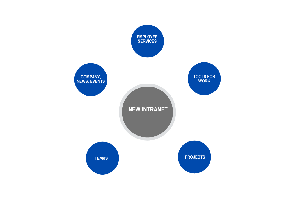
If you are using department style navigation, consider restructuring content by function, similar to the example below.
Restructure content by function
As tempting as may be, remember not to copy someone else design. The context will drive the usability, so it needs to be specific to what your employees are looking for.
With a recent customer of 700 employees, this took my team two workshops and a tree test to gain over a 200% increase in findability, even on a first test run.
2. Our intranet is a dumping ground for everything
What users say
You may hear users say this “I didn’t know where to put this file, so I uploaded it to the intranet.”
What is happening
No governance
There is no agreed-upon process and place for employees to share files, so they upload it into the temporary location, which becomes permanent over time. Quickly libraries on the intranet become crowded with draft versions of old documents. Now, these documents come up in search results for other employees who quickly lose faith in intranet search usefulness.
Poor permissions
In one customer’s case, we found that some employees didn’t have correct permissions to sites they needed, so they uploaded files to the wrong folder.
What to do about it
Review content structure
First, review your site structure as described above in #1, you may need to clean it up first.
Assign permissions to the structure
Next, go through each of the sites on your intranet and assign the Owners, Members, and Visitors. This will prevent unintended users from uploading content to the wrong parts of your intranet.
Here is an example of how this can be tracked.
Finally, create a page where all employees can see a list of sites they have access to.
Create a one-stop-shop for sites
Some of our clients who use MS Teams were unaware that each MS Team creates a SharePoint team site where all of the shared documents are stored.
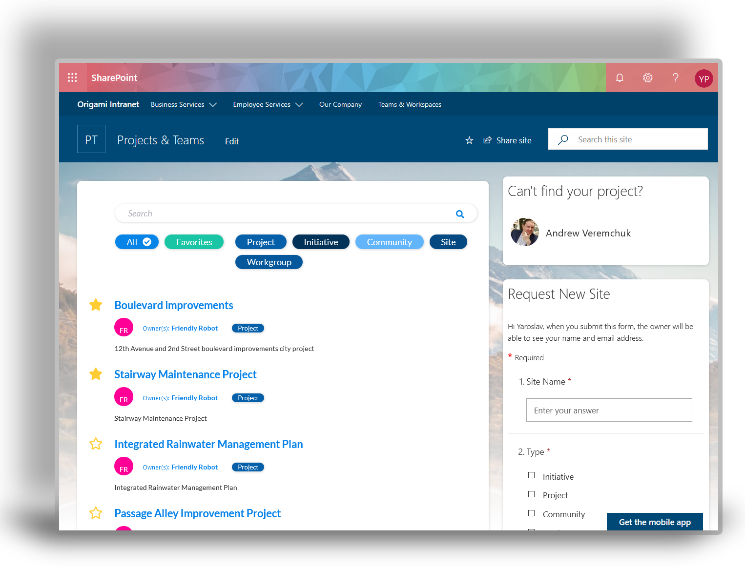
Help employees find the sites they have access to. The simplest solution is to use the out-of-the-box SharePoint online site list. For some customers who find the out-of-the-box view a little bit cluttered, we recommend a site directory below to automatically show sites grouped by a category such as Project, Client Site, MS Team etc. It speeds up the search, brings some additional site information at a glance and respects permissions.
Site directory showing all sites user has access to
3. Can’t find what I need / Intranet search doesn’t work
What users say
“Our search doesn’t work. I can’t find the latest version of a form or a template, and if I do find it, often, it’s not the right version?”
This issue is often coupled with this common myth:
Results of the study we did by watching the interaction of 322 recorded user sessions show that only about 15% of employees (mostly advanced users) used the search box on their intranet to find things.
What is happening
Working documents are mixed with moderated content (ex. templates, procedures)
Intranets built a while ago often have information sprinkled everywhere. For example, templates, procedures, and forms are sometimes on department sites, and some can be on landing pages of your intranet, others can be in your HR system.
No one-stop-shop for the moderated content (ex. templates, procedures, forms)
In one customer case, we saw a new policy announced in a news post, which made it unavailable after the news has expired. Intranet search picks up everything, and it’s hard for employees to distinguish which documents final and reliable sources of truth and which ones are drafts or older versions.
What to do about it
Create a one-stop-shop for the moderated content
Having a one-stop-shop library for your: forms, templates, policies & procedures, manuals, and requests can make a big difference. This doesn’t mean you create a single one-stop-shop for all types. For our customers, we first list what types of content they will have and then create one-stop-shop libraries for what’s needed.
Use tools to help find content by categories (ex. policies, forms)
For example, a separate library for Requests can make a lot of sense if you have a lot of those, but if you only have a handful, then perhaps they can share a library with the Forms Library.
Form and template directory with tags and search function
When tested for findability, we found that employees would instinctively look in the Forms library when they needed to say book a vacation or procure a vendor. No more hunting around department sites and pages to find that form.
Keep working documents separate (ex. keep them in team sites)
What matters is that those final documents are kept separately from your working documents, for example, project documents. In our usability tests, we often find that employees search for working documents because they’re not quite sure what they’re after. But when it comes to forms and procedural content, they prefer a list or a one-stop-shop directory.
Create landing pages to help find moderated documents (ex. HR landing site)
Sample intranet department page
To implement a one-stop-shop directory, it can be as simple as using a SharePoint document library. We like to use our library app because it allows us to bring multiple types of documents and any related forms and actions that may go with the document. For example, in above screenshot, if I search for a vacation request, I may also want to see what’s why remaining vacation balance, and you can access both from a single place.
4. Most things on our intranet are stale
What users say
“The news carousel shows news from six months ago.” “The home page hasn’t been updated in a year.”
What is happening
There are usually a few issues here:
· Lack of content ownership
· No consistent workflow to update the content
· No feedback loop for employees to report stale content and give feedback
The content was initially created by someone when the intranet was first launched, but then this person moved on to their day-to-day job, and no one was assigned to keep the intranet up to date.
You might have had several people responsible for maintaining various parts of the intranet. Yet, after the launch, this responsibility has not been assigned for anyone to do consistently. Time flies, and that’s how you end up with six months old news articles.
What to do about it
Assign one responsible person for each area of the intranet
Start with assigning authors (not just owners) to key parts of the site, like we did in section #2 [Our intranet is a dumping ground for everything]. You need to identify specific people (not just departments):
· News updated by someone from marketing & communications
· Employee essentials updated by someone at HR
· etc
Set automatic reminders when content is about to expire
Next, set a workflow to update key parts of the site consistently. For example, in one company, we set up a 15 min weekly news editorial meeting to craft the next news post. Several days after the meeting, the author would craft the news post and sent it for quick read and approval. This was a weekly activity and, after a month, became a routine. Allocating someone to maintain a piece of your intranet means you need to give them time to do that, even if it’s 3 hours a week.
Allow employees to easily provide feedback
Finally, give your employees a way to provide feedback if something on the intranet doesn’t sound right. This can be done by providing contacts to key pages and letting users know who to contact or providing a “send a message” capability, as you can see below.
5. It’s dull and boring / no reason to come back
What users say
“Our intranet is nothing but corporate marketing.”
What is happening
Content is not curated to the audience
The content on your intranet has not been designed for what your employees need. It’s been guessed. We hear this a lot in growing organizations who want to launch their intranet fast.
Intranet is seen as technical tool not an employee engagement tool
One of the customers we worked with assigned an IT department to launch their intranet as a technical initiative, and stakeholders from other departments were not involved. It was supposed to be a pilot initiative.
The IT team representative did their best at figuring out what users might want to see, and this pilot intranet design was solely an educated guess. When shown to a wider group of executives, the pilot was rejected. In their opinion, the pilot was a mere replica of an antiquated file share structure the company was using.
The entire initiative had to be started all over again, now with the design team involved, which is how we got involved.
This is not the worst-case scenario. The worst and quite common scenario would be to launch the intranet to the entire user population and observe poor results:
· Page visits fading away with employees finding them useless
· Pages not maintained because no owners were assigned
The entire intranet slowly disappearing from everyone’s radar
What to do about it
Fortunately, this situation is relatively easy to fix if approached in the correct sequence.
Design your content with key stakeholders, not alone
Start by inviting key intranet stakeholders to a content workshop. Those stakeholders are usually: communications or marketing, IT, HR, business units. In some organizations, business units may include health & safety, engineering, finance etc. These stakeholders will provide the content they see is valuable. If you facilitate your workshop with a focus on the stakeholder needs, they will be your supporters and more willing to help with broader adoption and change management.
Build pages around employees needs
I mentioned in #1 [The intranet is not intuitive] that it takes as little as two workshops to build a relevant intranet structure.
Sample intranet home page
Test your assumptions
In our projects, in addition to involving stakeholders, we also do a tree test. The tree test measures how relevant is your intranet according to a sample group of real users who work at this specific organization. We run our test with 10% of company users. Combined with suggestions in #4 [Most things on our intranet are stale], you’re on your way to converting dull and boring intranet to a thriving hub of activity.
6. Things are inconsistent
What users say
“Some “projects” are sites, and others are folders. Some sites use metadata, and others don’t. Some pages are neat; others are messy.”
What is happening
Pages and sites are created ad-hoc without using a template.
No or unclear ownership of the content
This usually happens because there is no ownership of the page or a site, so everyone has access to make changes.
No template for pages or sites
In other cases, the owner might be there, but because there is no template, everyone makes changes to the best of their knowledge.
What to do about it
Define owners and authors
First, if there is no clear owner for a given type of content, define those owners as we did in #2 [Our intranet is a dumping ground for everything].
Make owners known to users
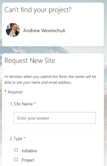
Now that owners are defined, everyone needs to know who they are. Below is an example of what can be used to identify owners for key areas of the site. If I see a broken link or need more help, I know who to ask.
If there are just too many requests for a single person to handle, invest in automating the process of creating new pages and sites using a workflow.
Whichever is the process, build a template for your sites or pages so that each new type of content is consistent with the rest.
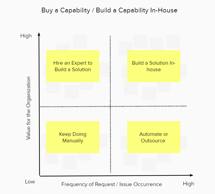
Buy or build the workflow to automate requests
It might sound expensive to build a workflow to automate something like this.
Here is the guidance we use with our clients to help them determine whether something is worth automating or doing manually.
Should you build the workflow in house or buy one off the shelf
As you can see, if the issue occurs often enough, automation or creating a solution might save money in a long run.
7. Too hard to use/broken
What users say
Parts of the Intranet don’t work, and some links are broken.
What is happening
“Broken” can refer to a lot of things, and even though we may know what employees might be referring to, it’s worth clarifying the context. The issue might be very specific to the task employees are trying to accomplish or “broken” as in poor design.
Confirm users’ expectation / “broken“ may mean something else
When we do usability tests for our clients, we find all sorts of culprits, but users mostly refer to broken links, being stuck in a specific workflow and even not able to work a 3rd party tool launched from the intranet.
What to do about it
Observe users in action
One of the easiest ways to clarify what’s broken is to observe your users in action. They may not be able to articulate the issue or use the wrong terminology.
Set up recurring help desk drop-in sessions
If the idea of observing each user scares you, try this method, which we adopted on each of our intranet projects. Set up once a week open to anyone drop-in hour. This can be set up as a remote meeting so employees can drop-in if they need help and share their screen. Others can benefit from observing what the issue was and how it was resolved.
If the issue has to be fixed offline because of the bug or a broken link, then users get instant feedback that it’s not something they did wrong.
We find that after the 4th session, most common issues are resolved, and the drop-in hours can be changed to on-demand.
8. Too many clicks to find what I need
What users say
Too many clicks. Why can’t things be 2-clicks away?
What is happening
The research shows that users don’t mind clicking more than three or so clicks. It’s whether those clicks are simple an intuitive or do they have to figure out what to click, try it, come back, click again, and so on.
The page below illustrates complex navigation (3 levels deep), but because of the intuitive site structure design and naming of labels, things are easier to find.
What to do about it
Observe user behaviors
When we hear this complaint about too many clicks to find something, we do a tree test with a small group of users and see what their thought patterns were. We start by asking them to find a piece of content and then watch their behavior while we measure their patterns. This gives us insight into how employees think and whether label changes are needed.
Consider simple relabeling based on your observation
Often label changes are required, and in many cases, some content areas need to be expanded or consolidated.
Consider using a megamenu
Having the right labels, we often suggest using a mega menu on your intranet. Megamenu allows your employees to explore available content before committing to the click and having to go back.
This should not be used as a quick fix without considering labels first. If your navigation labels are vague or not intuitive, megamenu won’t help your employees find things easier.
9. Most of our intranet pages are useless
What users say
“I can’t find the information I need, even when I search for it.”
This is also often coupled with this common intranet myth:
In the screenshot above, the darker the color, the fewer employees see this part of the intranet page. The results are coming from our study of 322 unique user recordings.
These days, many page designs introduce a deeper scroll to make pages look nicer; this includes Microsoft's own template you see here.
What matters more is what content is on those pages because most users never make it to the bottom of the page. More tips to come, follow to stay in a loop!
What is happening
The resulting pages are correct but user expectations are missed
Usability analysis we did for our customers shows evidence that employees find all the right pages, but they still can’t find “the right” information on them. Say, if I want to book a holiday, but before I do that, I want to check my vacation balance so I can adjust the length of my time-off.
Information on pages is incomplete / doesn’t “answer the question“
If I search for “vacation” or “time-off”, I find the correct page, but that page only has the procedural steps but not related steps, such as checking your vacation balance.
It’s to do with how content is written. Pages and articles just don’t have enough information users expect to see.
What to do about it
Not every organization can afford a full-time content writer, so we all try to do our best while doing our primary job.
Improve your content writing process with this checklist
I often recommend the following content writing process can help to create informative pages that meet employee needs:
· Define your target persona (for example, everyone, or just your salespeople, or only people who do business travel, or people who work remotely?)
· Define what do they want to know / their need (for example, salespeople doing business travel might want to see a list of approved hotels, per-diem amounts, and rental car limits)
· Build out the skeleton of the article in the bullet point (layout of exactly what you’re going to say in bullet point to deliver the solution to their need)
· Draft up a page that matches the skeleton (use quick links, faq’s and other apps to help locate those extra actions they may need)
Structure your pages with the content you come up with using the checklist
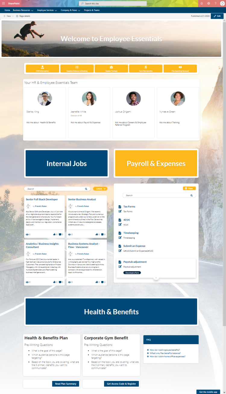
Pages written this way are more likely to contain complete information your target employee persona needs and not just guess what they need. Here is an example of the page written this way.
Resulting landing page for new employees (built with the checklist approach)
What about your intranet?
What are the things you hear from your users? Drop a note in the comments below.
Reading all this and feeling like talking to an expert? I’m happy to have a chat.
Yaroslav Pentsarskyy is a Digital Workplace Advisor at Origami. He has been awarded as Microsoft Most Valuable Professional for 8 years in a row and has authored and published 4 intranet books.
Yaroslav is also a frequent presenter at industry conferences and events, such as the Microsoft SharePoint Conference and Microsoft Ignite.
Book a demo today to see how Origami’s pre-built intranet platform folds and shapes to your unique business needs and supports your employees.


