A great intranet feels like getting behind a wheel of a beautiful car - it's clean, and every little feature is thought of down to the tee. It's also easy to navigate, has a crisp design, and outstanding performance.
When organizations set out to build their intranet, they wonder how far SharePoint's out-of-the-box capabilities can be taken to deliver this vision.
Having a list of the most popular SharePoint intranet web parts and design examples below can help you see what your intranet can be and become a tangible reference in discussions with others.
What are SharePoint web parts?
SharePoint web parts are like apps on your phone. They enhance what basic SharePoint can do and let you customize it. You can mix and match SharePoint web parts like Lego blocks to create almost any page with no code.
Web parts can display data from various sources, such as SharePoint lists, libraries, external systems, or custom applications, and provide users with a one-stop-shop workplace experience.
In this blog post, we'll cover the top SharePoint web parts to help you turn basic SharePoint pages into a beautiful and easy-to-use SharePoint intranet.
Top SharePoint custom web parts for 2025 in action
Top SharePoint Web Parts
1) Sharepoint navigation bar
Top navigation is still the number one way employees find their way around the intranet, so it needs to be prominent, clear, and well-structured.
Out of the box, SharePoint provides a decent starting point—it supports mega menus, lets you align colors with your site’s theme, and allows you to upload your company logo.
But if you’re aiming for a modern intranet that looks and feels like a real company website, the default navigation can feel limited.
What SharePoint’s built-in navigation doesn’t let you do is go beyond the basics. You can’t change font size, add navigation descriptions, resize your logo, or apply specific brand colors for individual elements.
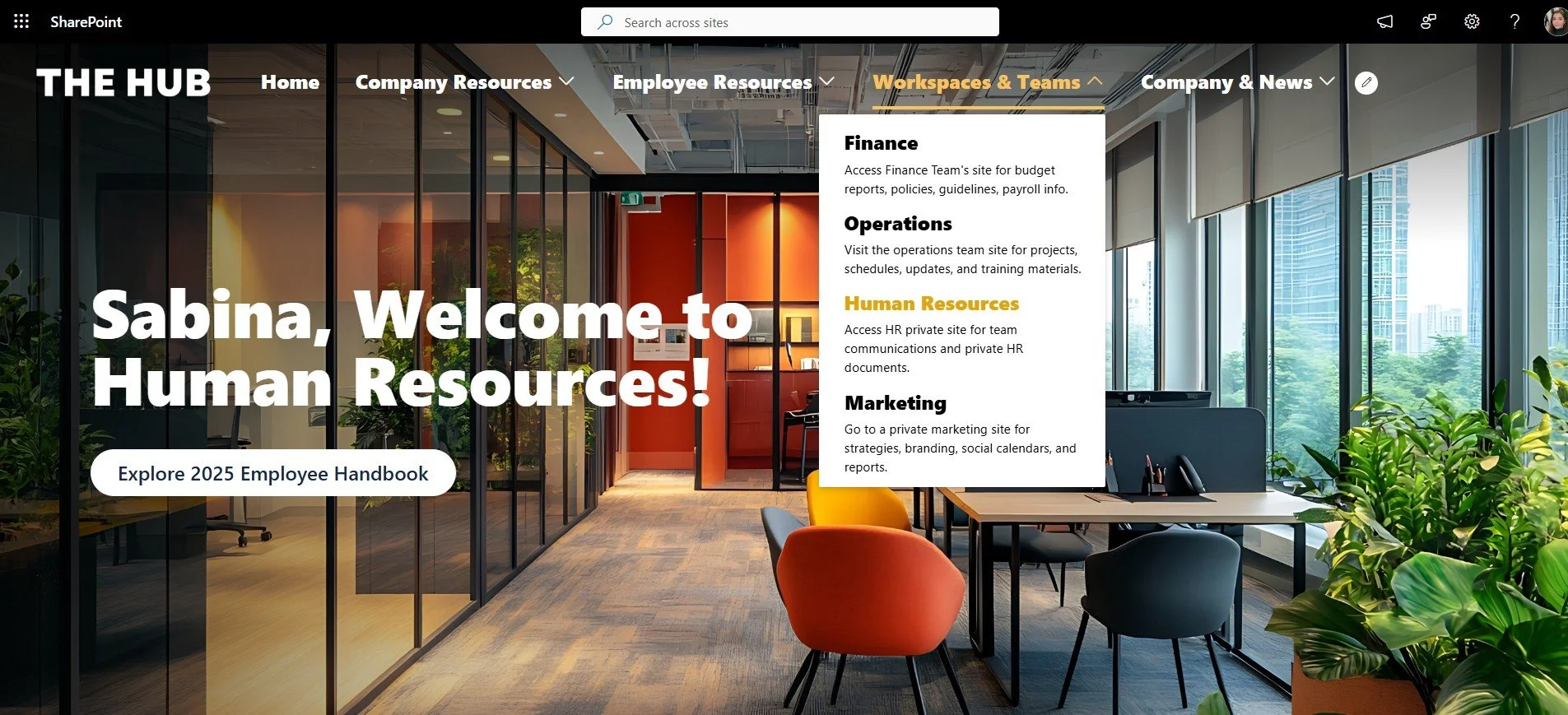
Origami’s Navigation Bar bridges those gaps, giving you full control to create a navigation experience that aligns with your brand and improves usability.
Immersive top banner with a navigation bar on SharePoint homepage
It’s bold, prominent and descriptive —exactly what employees expect from a great intranet experience.
2) Personalized full-width news carousel
News and company announcements are the most popular features on any intranet, so they’re usually the first ones on the page.
These announcements are often placed in a full-width section to make them look more prominent.
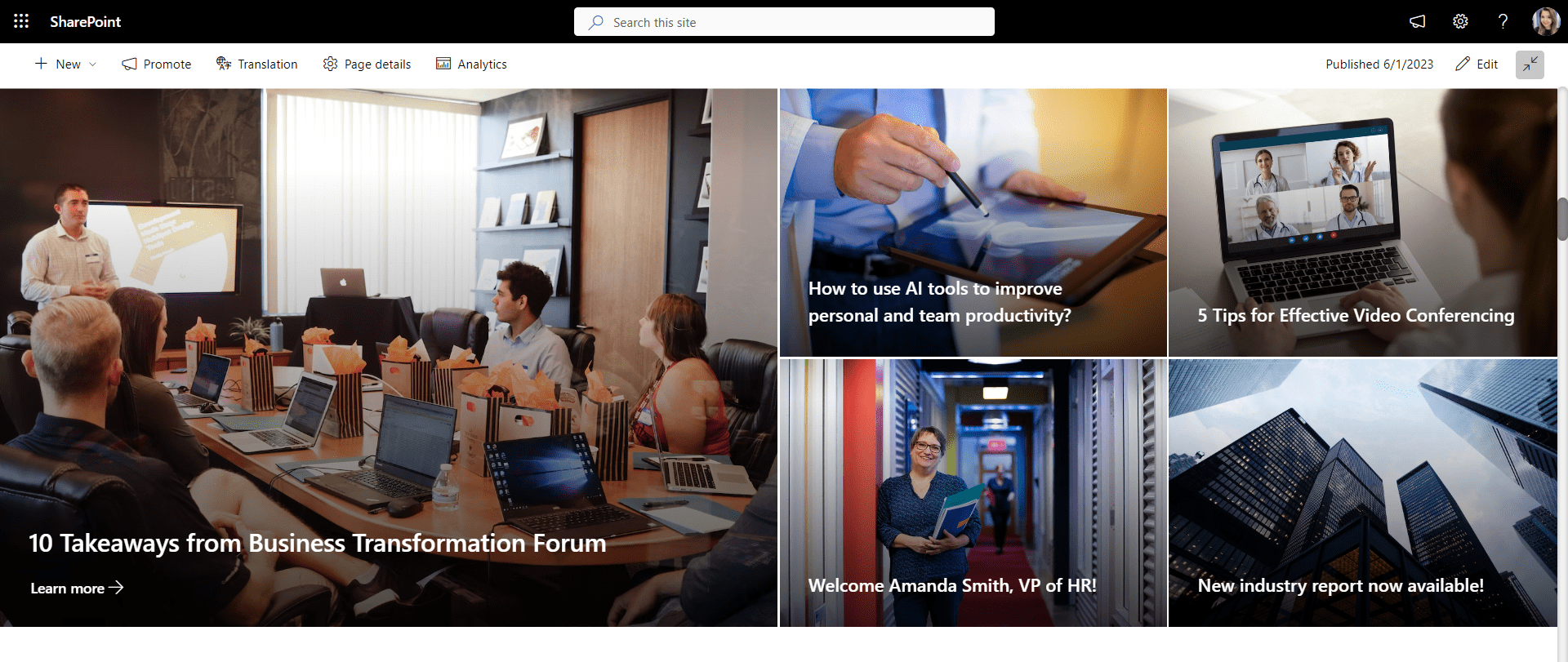
If you insert a full-width section to a SharePoint page, there are not many options with SharePoint out-of-the-box. And the options available, like the hero web part below, look pretty static and are not personalized to employees.
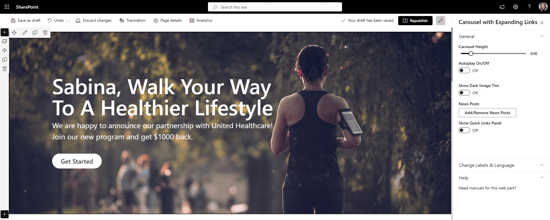
In contrast, when the first thing users see on the page is their name, along with the latest announcements – now that will surely grab their attention!
That’s what the "Personalized news carousel" web part does. Not only does it recognize an individual employee name, but it also lets you easily adjust the height of the carousel, adjust the look of the image, add or remove a call to action button and even add relevant quick links matching the company branding.
The resulting news carousel really grabs attention and looks modern, similar to any public-facing website users are already familiar with.
3) Color-coded SharePoint calendar web part
A SharePoint calendar with events on the homepage is a table stake, and it’s available with SharePoint out of the box.
The problem is that when you have events for the whole month—they can easily overwhelm the page, like in the example below.
There is no way for employees to select a date and see events for a specific week without leaving the page.
Now, having those same events show up neatly for the upcoming month with color-coded categories and the ability to RSVP is a game-changer.
The color-coded calendar web part shows events from a SharePoint site, so I don’t need to re-enter anything.
You can define colors for event categories, making it easier for employees to spot relevant events. Users can filter and search for events on the same page, much like they’re used to on airline and hotel booking sites.
The ability to see who RSVP’d to attend the event can help organizers plan for enough time, space, or food.
4) Quick Links web part
Everyone needs access to quick links to launch applications and frequently used resources like benefits, payroll, and helpdesk from the intranet.
There is a SharePoint quick links web part available out-of-the-box that you can use. It lets you pick a URL and make basic button changes like adding icons and updating button arrangements.
These basics may not be enough to stay on the company brand. For example, only the admin can change the color of quick links; even then, when they do that, all the other parts of SharePoint will change color.
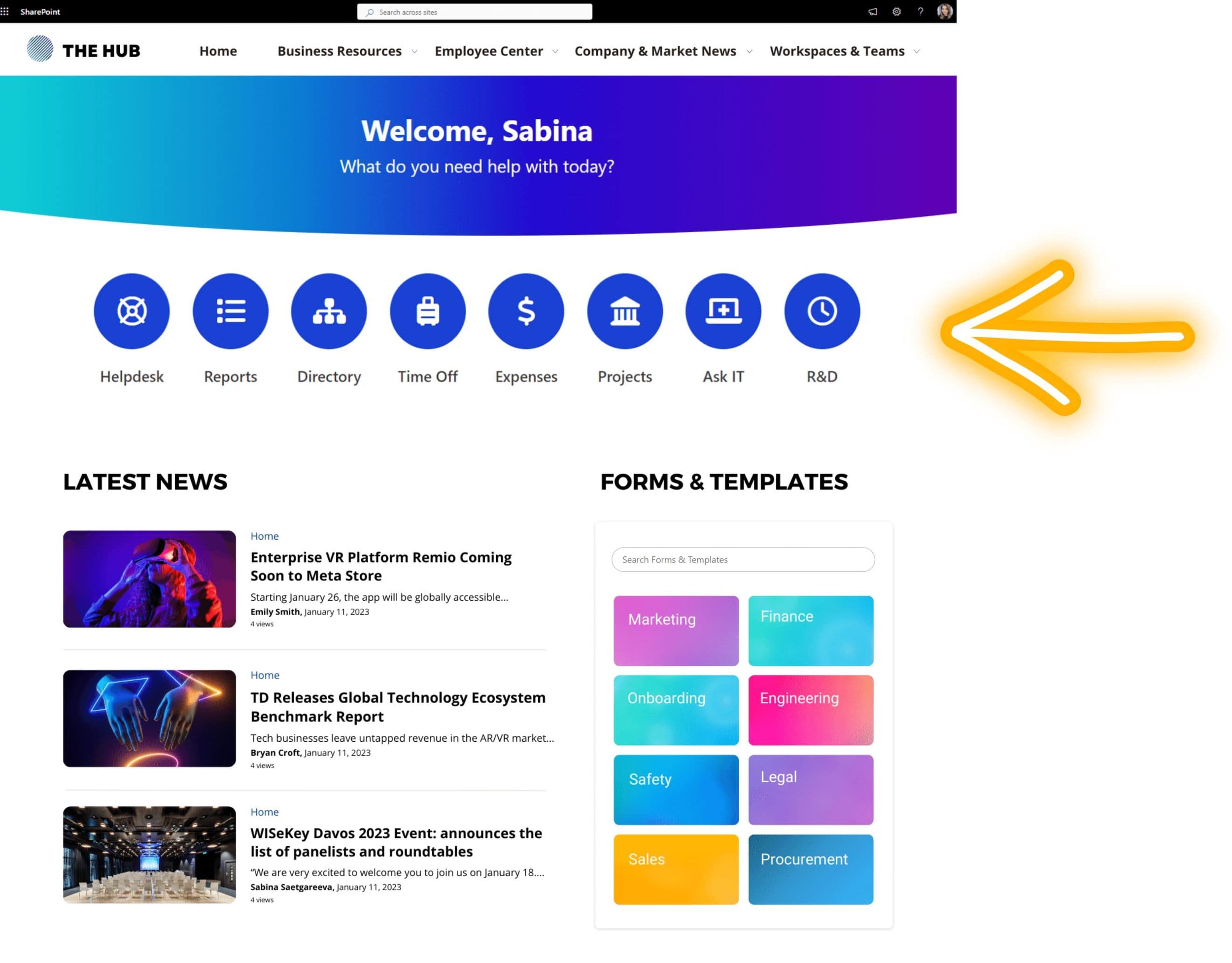
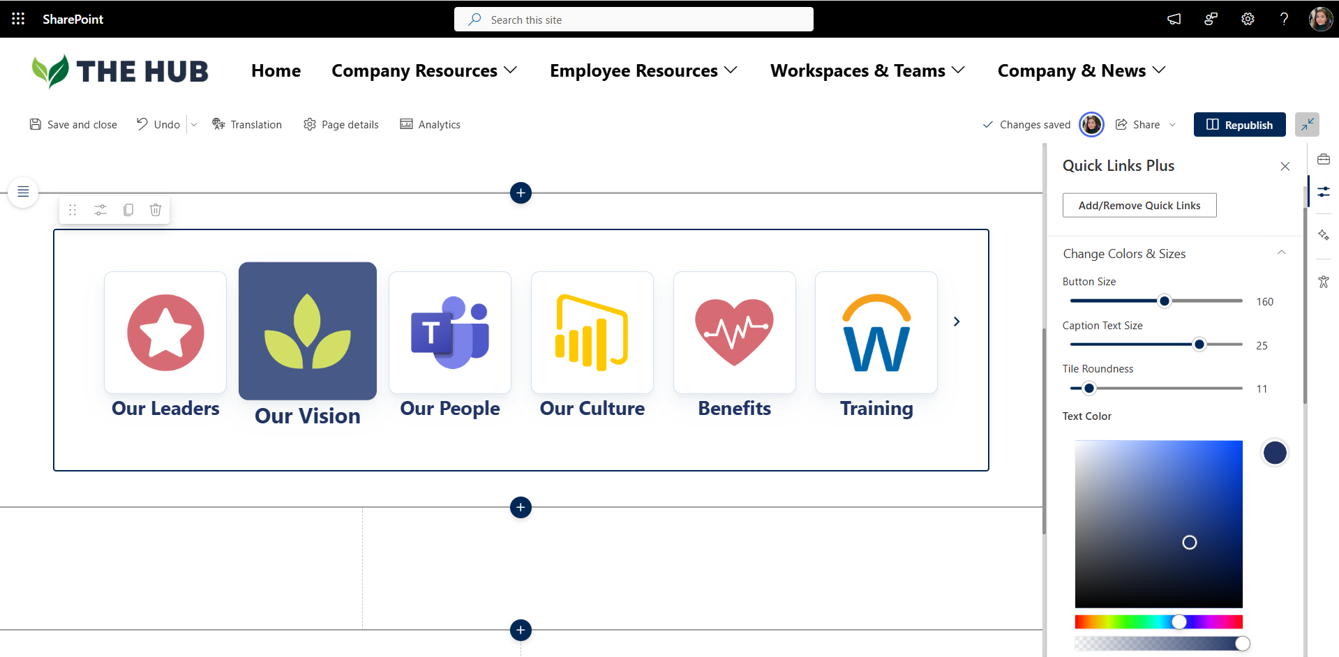
There is a lot more flexibility with Origami quick links web part.
You can change the size and the color of the quick links to give them a unique style and make sure the text isn’t cut off in any way when the text on the link is too long. And it’s super easy to edit quick links, as all the customization options are available in a single edit panel.
5) SharePoint search for document library web part
Every intranet needs a one-stop-shop directory for company-wide forms, templates, policies & procedures. For that, you can use a Document Library web part available in SharePoint out-of-the-box. Below is an example of how it looks.
Even though it is a very functional web part, it looks more like a file share from before the ice age, and where is the search so employees can search across this library?
There is a better way to do this. Here is an example of the document library created with the Origami Finder web part.
It’s bright, it’s on-brand, and it’s so much easier to use. With this web part, employees can search across the library or click on the categories. You can easily change the font size and colors of these folders to match your brand.
And guess what? Behind the scenes, the data is stored in the same familiar document library, so you don’t need to move any files or links.
What makes this web part even more powerful is its flexibility. You’re not limited to one source—you can pull in content from multiple document libraries, filtered views, or even different SharePoint sites, and show it all in a single search experience.
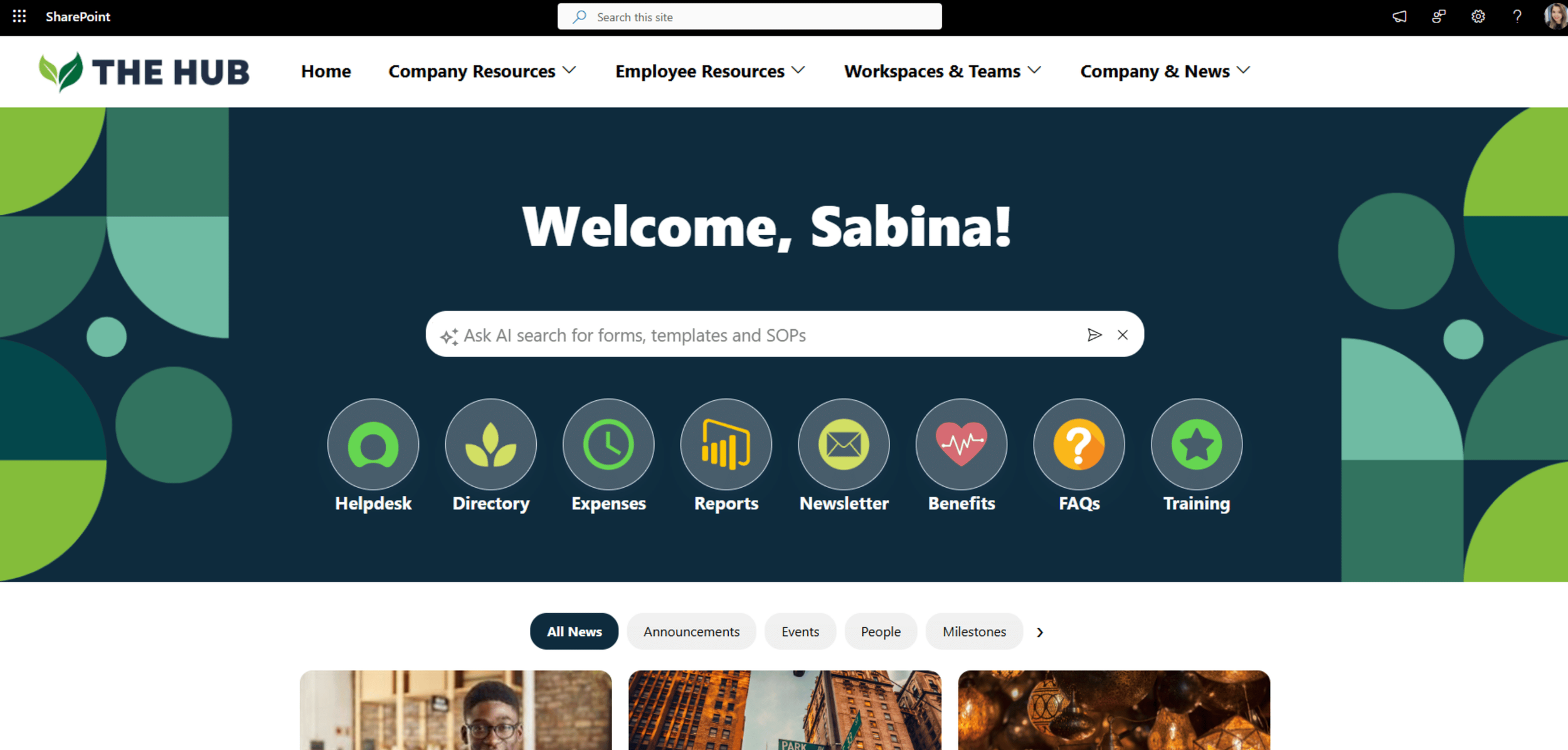
And if you want this search experience to be even smarter and more prominent on a SharePoint page, you can use Origami Search Banner web part. You can connect it to specific SharePoint document libraries or pages, and it works like an AI assistant, answering questions about SOPs and guiding employees straight to the right forms, documents, or pages.
For users without Copilot license, it delivers the same powerful search as the Origami Finder, but styled as a bold, visual banner that instantly draws attention.
These five web parts are just a few features of the Origami intranet toolkit! If you like what you see, check out how the Origami SharePoint intranet solution compares with building custom SharePoint web parts below.
6) Employee directory web part
A great intranet helps you quickly find colleagues. This is a capability you can get on your SharePoint with the people directory web part. It can help you find your colleagues’ emails and phone numbers in alphabetical order like a phone book.
This out-of-the-box web part works great when you have a small team. But it may no longer be enough when you have multiple departments and office locations.
And, if you have several dozen system accounts showing up in your people directory (like the support account in the example above) – that makes things confusing for employees.
The Origami employee directory web part goes beyond basics. It automatically connects to your Active Directory and pulls employee images, departments, office locations, and other attributes.
If you have a specific person you want to find, you can quickly find them by their name or other attributes set in their profile. As an administrator, you can control, which attributes to show, if you need to apply filters to hide employees and system accounts, and more.
7) Org chart web part
Knowing who reports to whom can help employees understand the organization better and come to the right person with the right questions.
As organizations grow, leaders bring in new managers to the team, and they want the team to know who those new managers are and where they belong in the organization. The org chart is a popular tool for that.
You can use the out-of-the-box organization chart web part by setting the username of the person at the head of the organization.
If you click on any employee in this Org Chart (I clicked on Yaroslav in my example below), the page will take you to their direct reports.
You may want to go back and explore the rest of the Org tree. Unfortunately, with the SharePoint org chart web part, you will have to reload the page if you want to go back.
That’s not what most users will expect.
With the Origami SharePoint Org chart web part, you can freely move around the organizational chart, drill down to the user profile, and the whole chart follows the company brand colors.
Administrators can even selectively hide people from the org chart so they’re still in Active Directory but just not showing here. This can be useful if you don’t want to show contractors and system accounts in your org tree.
8) Birthdays and anniversaries web part
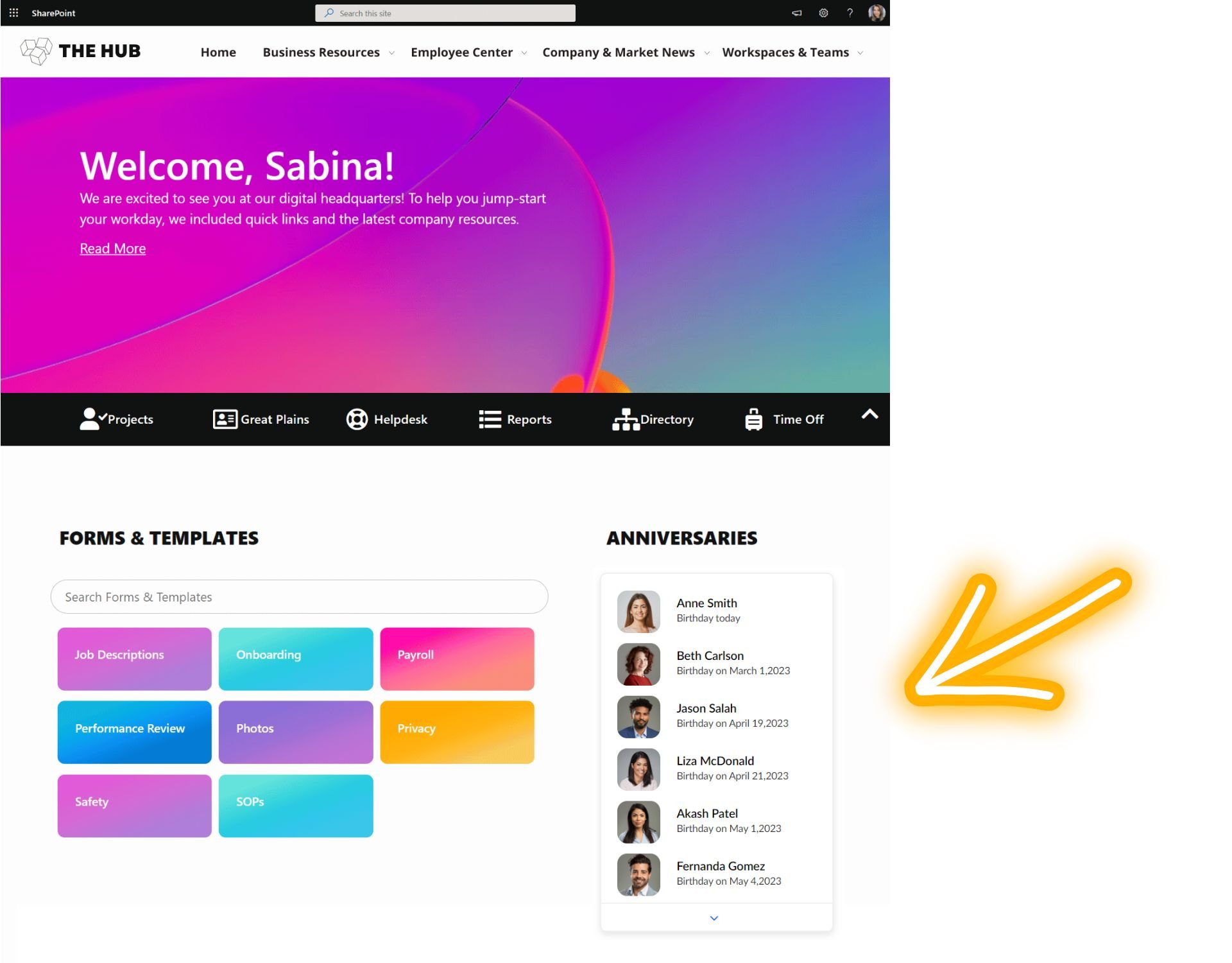
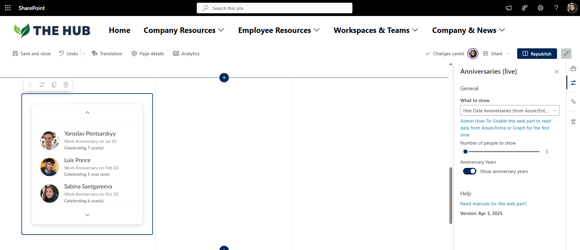
Celebrating employee milestones and anniversaries can help you bring your team together. Many organizations asked us about this functionality since there is no out-of-the-box web part for this. So with the Origami anniversaries and milestones web part, you can track all sorts of celebratory feeds. Here is an example.
The anniversaries web part automatically pulls employee birthdays and work anniversaries from Microsoft Graph or Entra, so you can import contacts from Microsoft 365 in just a few clicks.
And the best things is that as the new employees join the organization, the list updates on its own—so you don’t have to worry about manually maintaining it.
9) Social corner web part
Social Corner can bring a social media touch to an intranet.
You can set it up so anyone from a company can post announcements, welcomes, or recognitions, and employees can comment, reply, or like these posts.
This can be done out-of-the-box with Viva Engage. But many companies have told us they have a hard time managing an entirely new application with its own caveats, restrictions, and administration.
Social Corner web part from Origami is an easy alternative.
You can choose what to show in your cards, who can post, whether likes and comments are allowed, you can moderate, and even set alerts and workflows to archive or moderate the content. All posts are stored in SharePoint, so it’s easy to manage them all in one spot.
10) Video carousel web part
Videos with town hall recordings and leadership announcements are common on the intranet. Out of the box, you can save a video to Microsoft Stream and embed it on the page. Here is what this stream of videos can look like on the page.
Nowadays, videos are often used for training, and many of those resources sit elsewhere. It is common to see companies want to embed YouTube videos on their intranet pages. For that, you can use a SharePoint YouTube web part that can hold one video at a time, like in the example below.
But what if you want a stream of YouTube videos, similar to the Netflix video experience? And what if you want to include videos from other platforms as well? You can’t easily create a training feed with inside and outside resources unless you buy an expensive training platform.
An easy alternative is to use the Origami video carousel web part.
This video feed brings together videos from various sources (inside and outside), and it’s super easy to edit!
You can change video titles and descriptions and quickly bring any videos to the SharePoint site by inserting their URL into the web part properties. Once published, these can be watched right from the page, making the whole page more interactive.
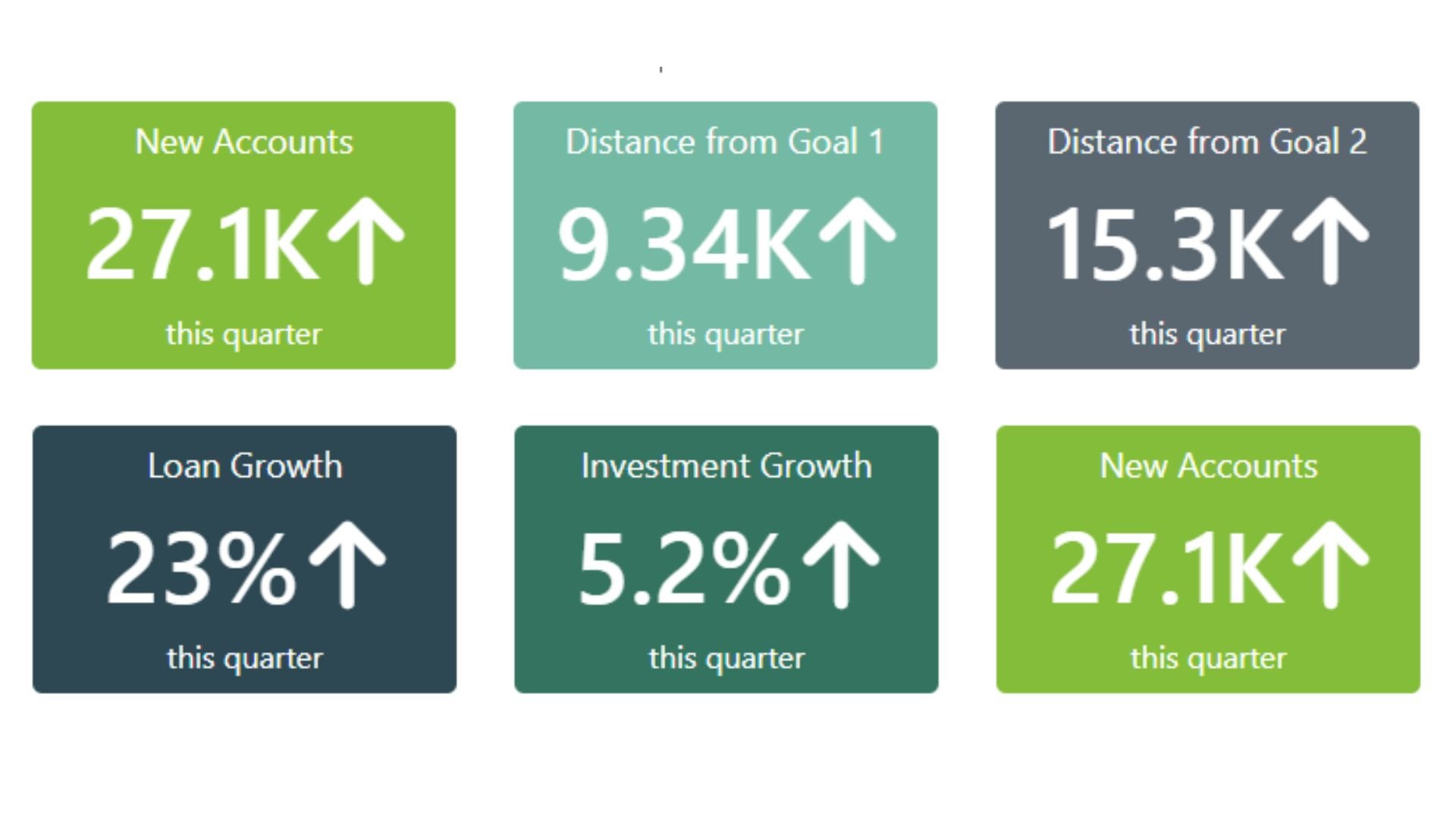
11) KPIs web part
Dashboards and KPIs are common fixtures on the intranet. Out-of-the-box, SharePoint allows you to embed a Power Bi report (with power bi web part) or an iframe that shows data from other sources.
Seeing live data you can drill into can be a powerful tool for decision-makers, but for an average employee, it’s a bit too detailed for what they need to know. It’s also slow to load on a page and requires extra authentication.
Many employees don’t drill down for details but would be interested in seeing overall company or department performance, like a stock ticker or an airport departures board.
The Origami KPIs web part is a simple and elegant solution.
You can easily change KPI values and colors in the edit mode, like in the example below.
There is a lot of flexibility, and you can connect this web part to a SharePoint list and automatically grab that data from other systems.
12) FAQ section web part
When the company is growing or changing, and new people are joining every week, you might be asked the same question several times. Hopefully, you’re giving the same answer! But why worry about the answer? Give your mailbox a break.
You can create a set of FAQs and direct employees to an FAQ.
SharePoint out-of-the-box lets you do that with collapsing sections and a text web part. Here is an example of how it will look like.
But it’s even more straightforward and sleeker-looking with the Origami FAQ web parts below.
The first web part is a modern FAQ section you would normally see on a company website, and the second one is a collapsing FAQ section with custom color blocks.
These Origami SharePoint web parts make it easy to add or remove FAQ questions and change the colors of the look & feel in line with a company branding.
13) Process timeline web part
Procurement, HR, and Finance teams rely heavily on the process. The most common is an onboarding process.
Help your employees understand what’s involved and what the steps are by breaking down an extended company policy into a small number of digestible steps.
Out of the box, there isn’t a web part for that, you’d have to create an image which can take a lot of time, and the graphic is not interactive.
With the process timeline web part, you can create a timeline linking to resources, even interactive forms or documents for each step, if that applies.
You can easily add or delete steps and match your company branding colors. The resulting timeline is modern and interactive.
14) Embed a script or code web part
Sometimes you need to insert a 3rd party web widget like a stock ticker or a report from another system right into your SharePoint page.
Embedding a code is perfect for that.
SharePoint's out-of-the-box code snippet web part allows you to insert basic code to the page, but it fails to run more complex enhancements.
Origami's "Embed Script or Code" web part is much more advanced and can be used to add almost any visual enhancements to SharePoint pages or help with sharing dashboards from Google Analytics, Tableau, or other popular platforms.
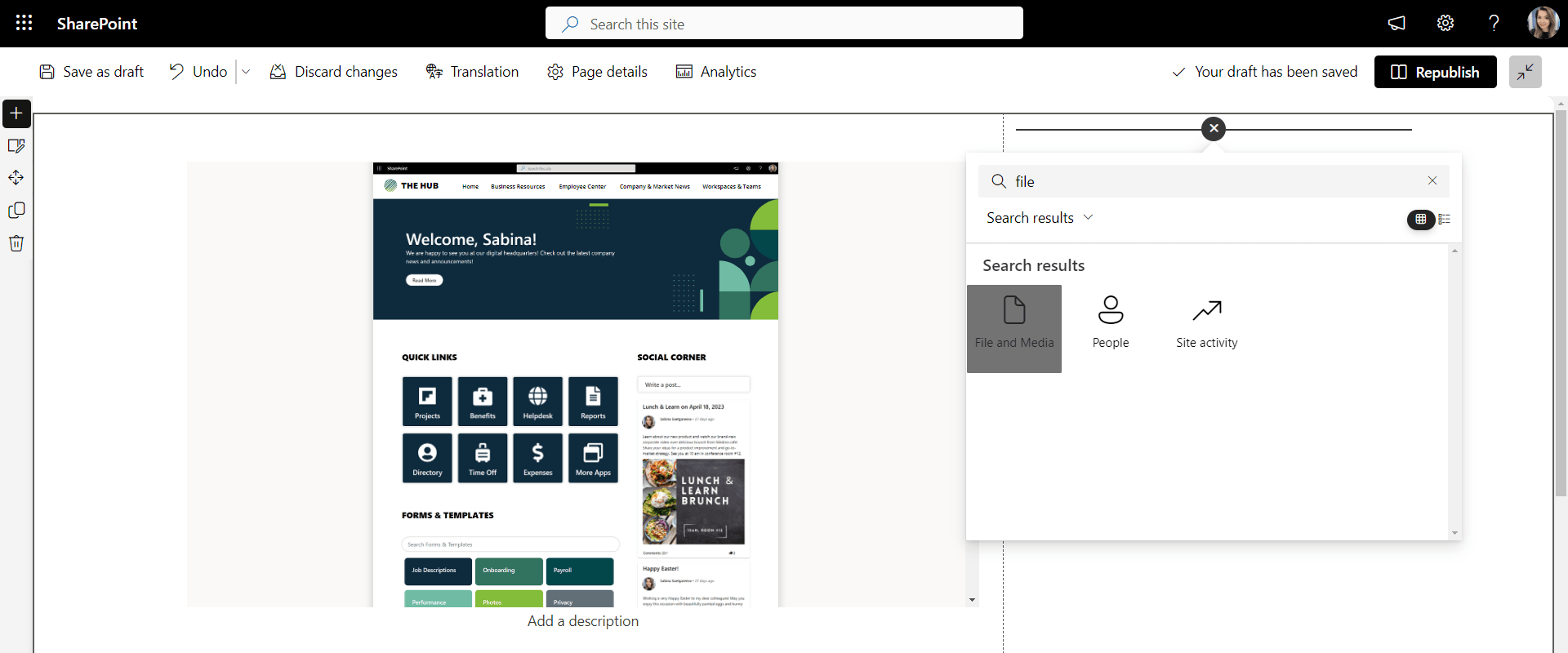
15) File viewer web part
File and Media Viewer is one of the popular SharePoint web parts available out of the box. This web part allows you to insert media files like PowerPoint presentations and PDFs into SharePoint pages. This is useful when you want to share a meeting presentation or if you want to show an employee handbook right on the page.
Here is an example of a PDF file inserted with the File and Media Viewer web part.
16) Quick poll web part
Polls and surveys are a great way to engage users on a company intranet. They can improve collective decision-making and provide insight into employee sentiment.
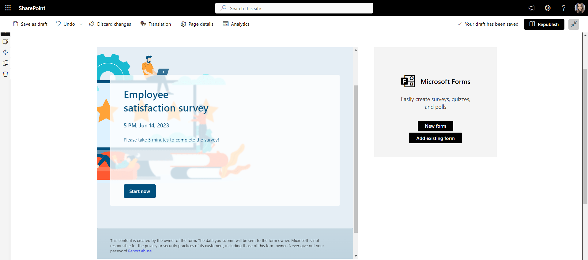
With the SharePoint out-of-the-box, you can create a survey with Microsoft Forms and add it to your SharePoint pages with the Microsoft Forms web part.
This web part works great when you have a survey with multiple open-ended questions. The limitation of this web part is that you can't resize it for a smaller section, and the survey/poll always comes with a disclaimer, like in the example above.
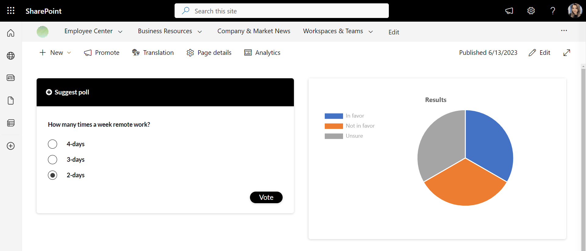
If you want a quick poll that perfectly fits into a smaller section of the page and is easy to style without leaving the platform, the Origami poll web part might be a better option.
It allows you to change the color of the header in line with your SharePoint design, and it fits perfectly into a smaller section of a SharePoint page. You can also enable users to see the results of the poll right after they vote.
How it all comes together
These are the most popular web parts in SharePoint out-of-the-box and Origami that turn basic SharePoint pages into a true intranet. Among these, a few other notable intranet out-of-the-box web parts not mentioned here include a group calendar web part, world clock web part, weather web part, image gallery, and countdown timer web part.
The PDF below shows how these and more modern SharePoint web parts come together in stunning and real page designs.
Use examples from this blog post and PDF to inspire you for your next intranet project!
Sabina Saetgareeva is a Digital Marketing Specialist at ORIGAMI. She helps infuse ORIGAMI brand with what customers need and seek. Sabina is an avid reader of the future of work, digital transformation, and trends in Digital Employee Experience.


