In my career of building corporate intranets, I’ve seen a fair share of businesses frustrated when they feel they just paid a premium for SharePoint intranet solution, and all they get is a daunting SharePoint starter page with nothing on it.
Where do you start?
I wrote this article to help you cut down on research time and show you some of the most popular designs and templates I’ve worked with over the years. For all our design examples, see the PDF below which we update monthly.
Now, onto page designs built on the latest SharePoint branding best practices.
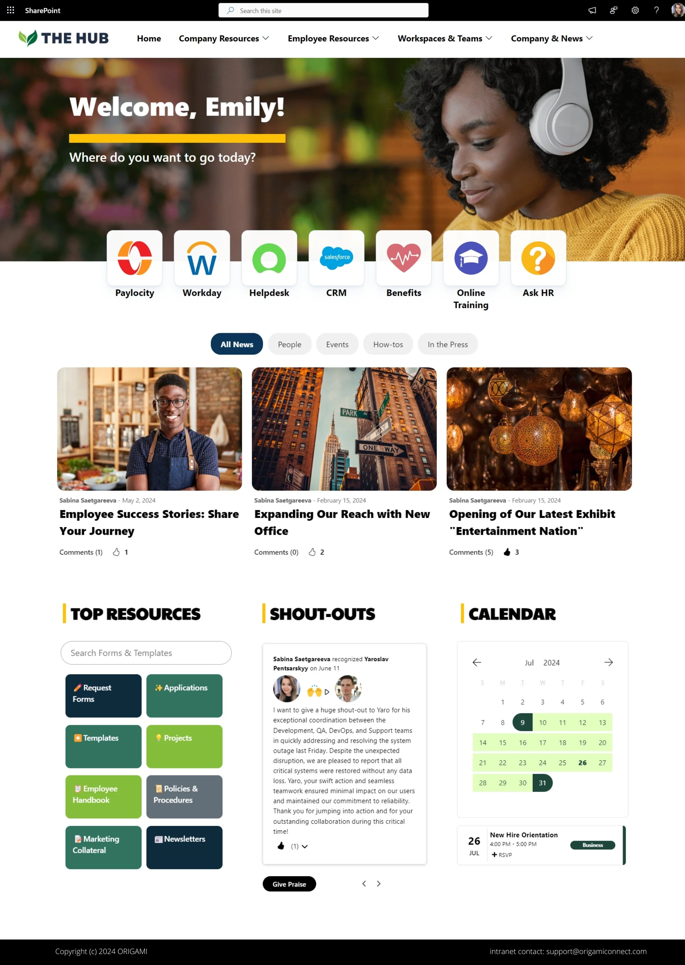
Home Page Intranet Template
The home page design is essential and yet is often over-branded (with too much on it) or under-branded (too basic).
Here are a few important considerations for your home page:
- Ensure your home page has a clear name, logo, and bold navigation
- Use corporate colors (coming from Style Guide)
- Have easy to access Form & Template search
- Prominently display quick links to applications
- Set up clear and well-designed navigation
- Organize news articles into tabs and enable like and comments for better employee engagement
- Don’t be afraid to make your page longer, people are used to a vertical scroll on their phones and PC
- Many of us now have widescreen monitors, use that space for relevant content
- Don’t forget to add some engagement; add interactive components like kudos and calendar
For more examples, check out the blog post below.
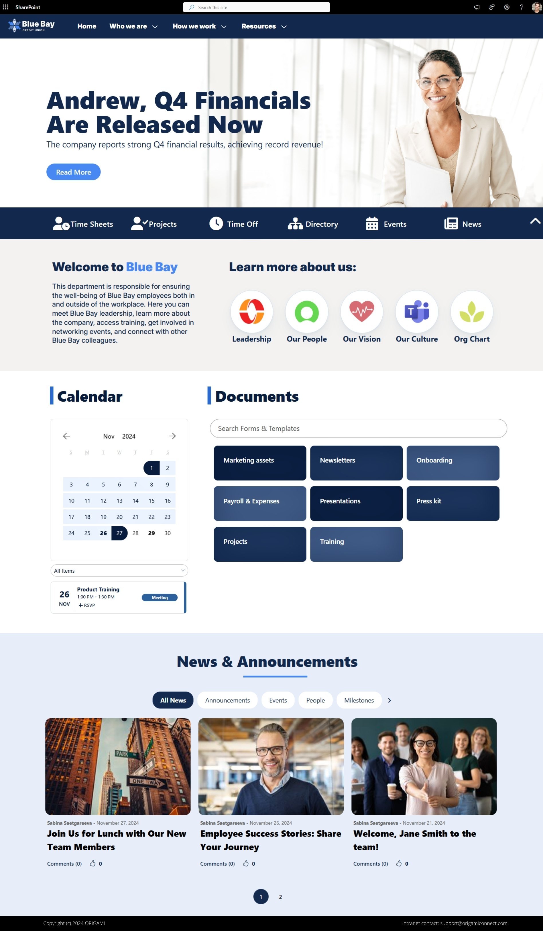
Another homepage alternative
Here is another intranet example of the homepage, a bit more toned down but still with a focus on the key elements:
Prominent action links
Commonly accessed links to applications (company-wide)
Company-wide communication/announcements
Easy to navigate forms & templates directory
Employee engagement elements - birthdays and bulletin board
Simple and user-friendly news slider
KPIs to keep everyone in the loop with high-level company goals
Here is more on how to design a great intranet home page with examples.
Landing Page Intranet Template
Landing pages for some of the critical areas of the site are a must for several reasons:
They provide a place for users to land
They group similar content and help new users not yet familiar with the hierarchy
They are the perfect area for KPIs, apps, and widgets that display a summary of information on lower levels of the site
For example, the systems availability widget can sit on a landing page for “Business Resources“ with a link to more details. Without this design pattern, the intranet would be just full of links.
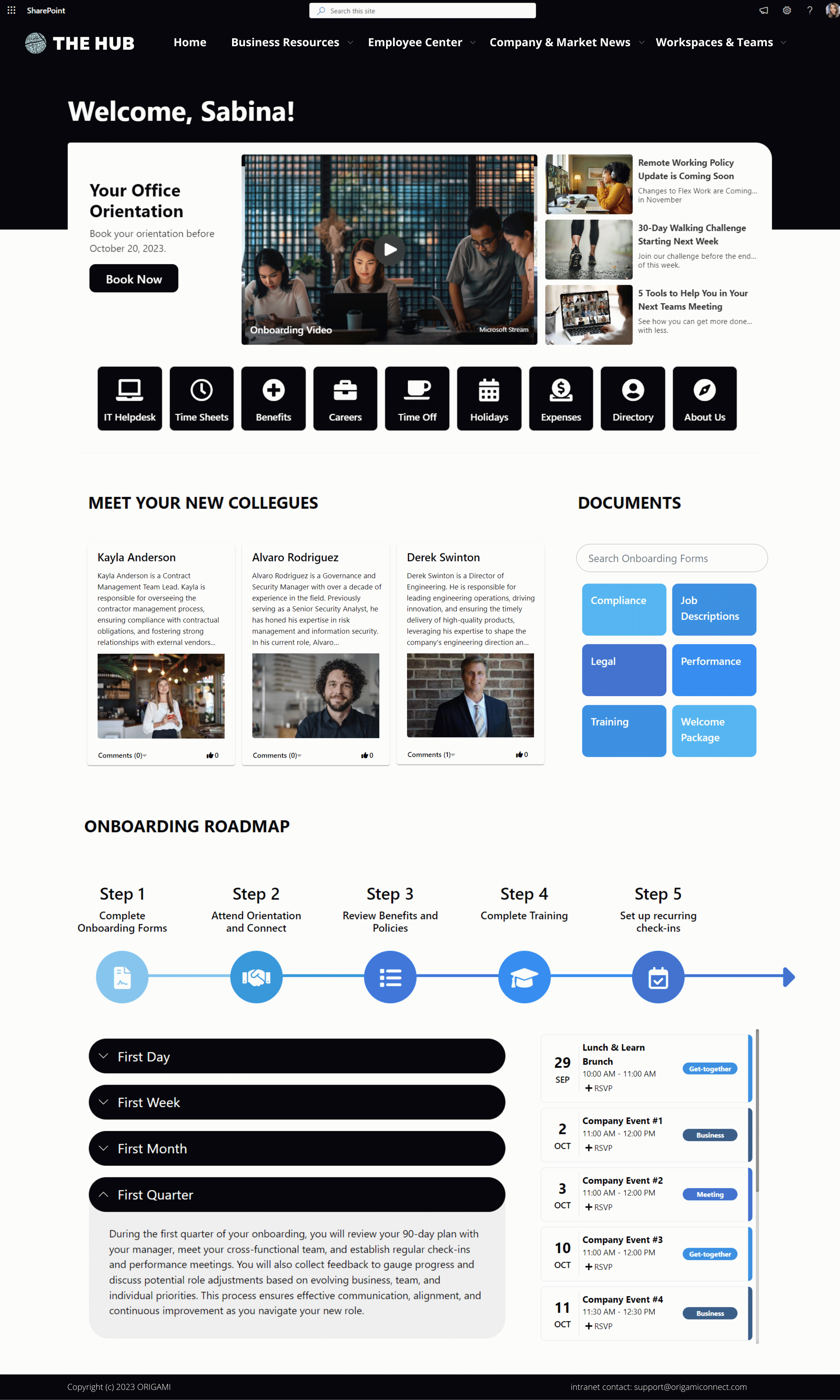
Below are examples of simple yet functional landing pages.
Few apps here:
Engaging welcome with each employee’s name called out
Quick links to the most commonly needed resources
A bright and modern info directory with relevant HR forms & templates
New joiner welcomes for everyone to get to know each other
Engaging process timeline and collapsing sections
Color-coded calendar with company events
Resource Hub Intranet Template
One level below each landing page is, in most cases, an Intranet Resource Hub.
Here are some examples of what this site design is typically used for:
Who We Are page
Delivery Processes
Employee Benefits Information
KnowledgeBase hub
Training Site
New Employee Site
These are sub-landing areas with content produced by one or more departments serving a particular business function.
This simple yet common design makes up most intranet information pages. The main strength of this page design is its simplicity. Users expect to quickly scan the content for what they're looking for, and this design delivers just that very well.
Another example of a resource site is the project site. A few key elements in the Project Site are shown below:
A personal welcome to each employee
Quick links to the most commonly used applications
Tasks, meetings, and recent documents specific to each employee
Calendar with project activities
Project status and progress
Here is another example of a resource site, which includes:
Commonly searched templates, forms, how-to’s, and applications
This ORIGAMI application will also record if some form or template was searched for and not found.
Administrators of this directory can then upload content that is frequently searched based on measurable data
New hire roadmap
Easy to navigate employee handbook
New employee welcomes and shouts outs
Intranet Content Page
Below each hub, of course, are article pages delivering simple access to content, whether a set of document libraries or just a page with relevant information.
Few things that each content page should have
Information chunking
Break down content into chunks rather than long pages full of text
Relevant images
Include images that are relevant to the content
Scrolling is better than clicking deep links
Users are more patient when they need to scroll down and scan for content rather than click on links and go back
Contacts
Contacts app will help with governance and allow the reader to contact relevant SMEs for this area instead of IT or Communications. Breadcrumb helps with the context of this page.
Considerations for larger organizations
There is no reason why a large organization can not use one of the templates above, except when there is too much content to serve on one page.
Here are the areas where we often see a lot more content in larger companies:
Many more forms, templates, policies, and procedures
Lots more employee engagement content/chatter
Many more team sites, department sites, and project sites
Here are some of the solutions clients find work for them
Create a dedicated space/ one-stop-shop foR
Forms
Templates
Requests
Policies & procedures
News
Here is an example of the News Center site that can hold all your SharePoint news, articles, and links.
Templates are essential to knowledge management and retaining organizational knowledge. If more of your staff can find relevant samples, the less work they need to do from scratch.
Some organizations create a separate directory for each type (Forms, Templates, Requests); others bring them all together.
Other types of sites which can use this Forms & Templates Center can be:
Glossary Database
Policies and Procedures
Knowledge-base
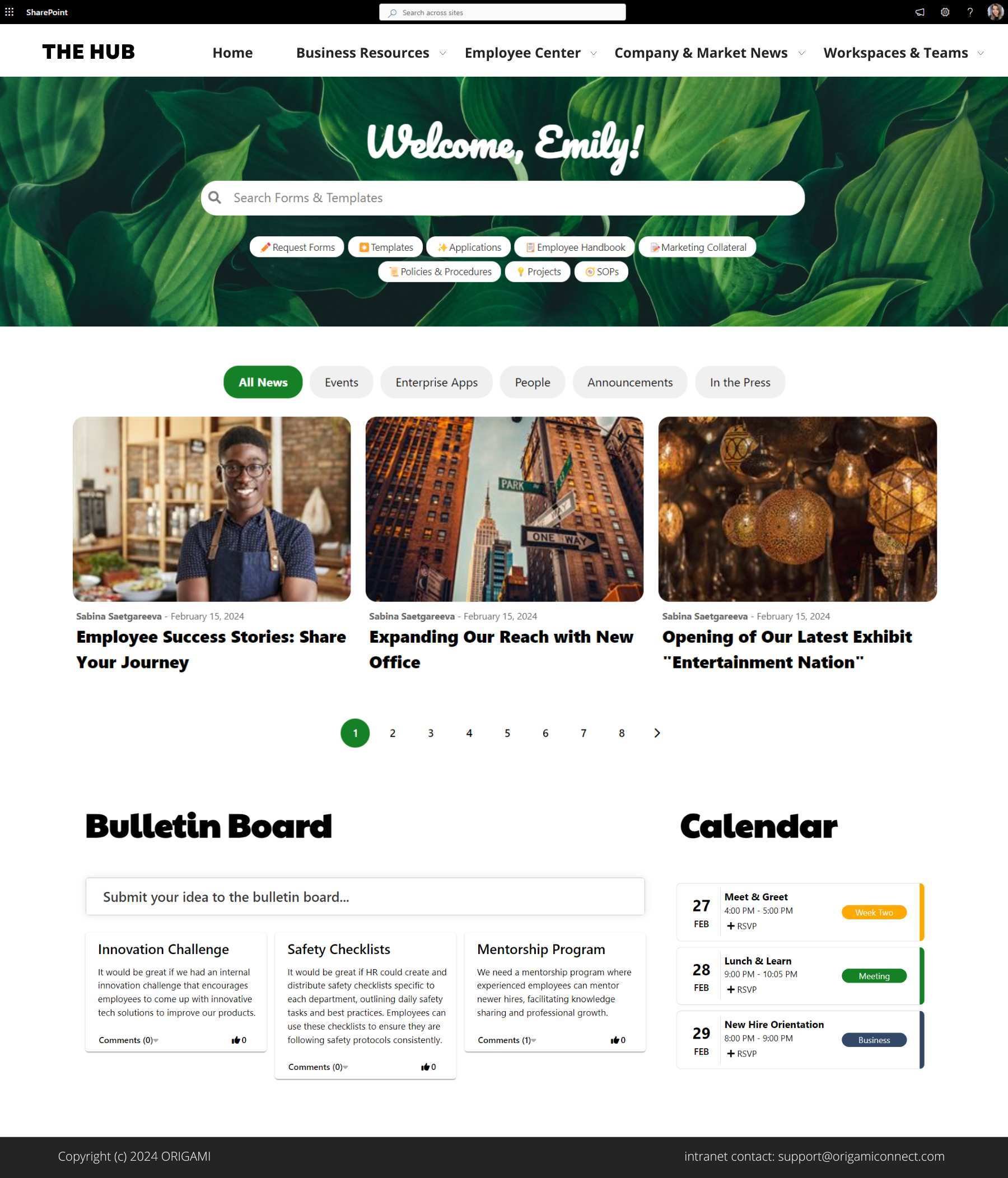
2. Have a Community Sites & Breakroom Area
In larger organizations keeping in touch with your co-workers often means having a place where you can share and read employee posts.
A dedicated community site or breakroom area can solve that.
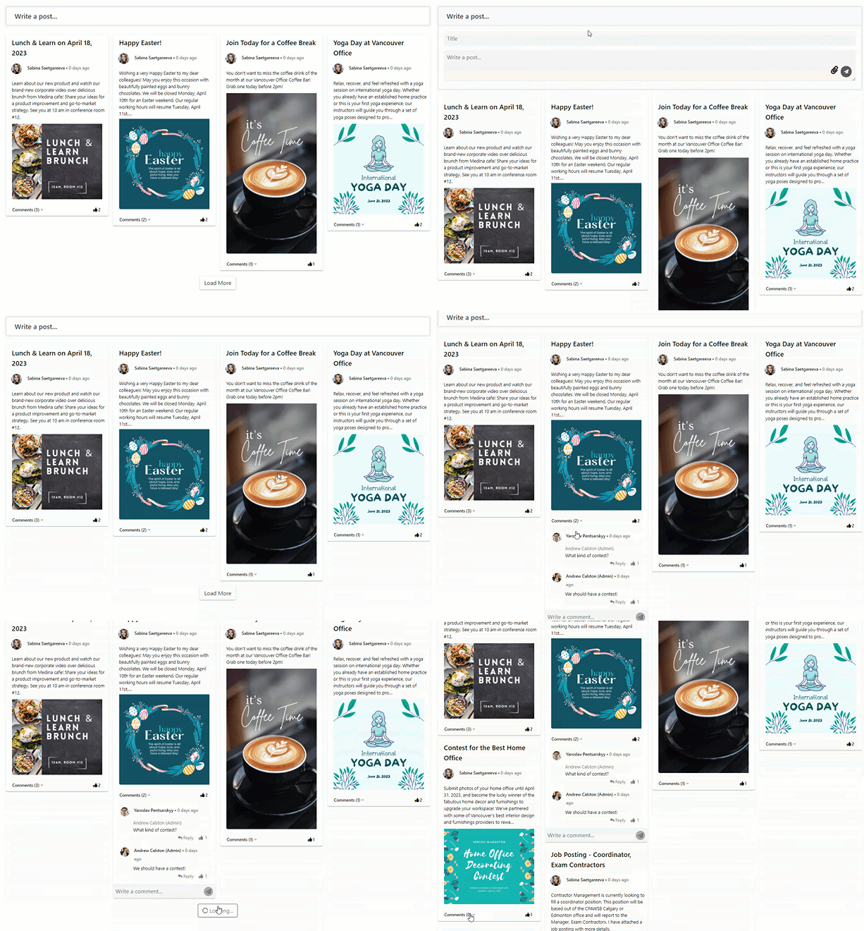
A great community site template contains a way for an employee to share feedback and ideas for others to read more, comment, ask questions, and post suggestions.
Here is an example of a SharePoint page with a community area.
3. Fixing content chaos
Larger organizations have a lot more team sites, department sites, and project sites. They add up as a by-product of working and storing information.
Without knowing where something should be stored, new sites pop up fast and clutter your intranet.
A cluttered intranet hurts adoption for everyone else because it’s so much harder to find things.
Before designing your pages, you need to design your content (or Information Architecture).
Here are the answers we uncover with content design:
what your employees search for most often (even before you have the intranet site ready)
how do they look for it, and where would they click
which pages you need to build (and which not to build, imagine the time saved knowing this in advance)
how should these pages be structured
should you structure sites by departments or function
are employees finding things the way you structured them
what’s the percentage of users that are “lost in clicks.”
Not sure what kind of design is right for you?
We’ll be happy to show you what other customers have done. You can get in touch to have a personalized consultation.
Did you like the templates in this post? These are part of ORIGAMI, our pre-built intranet solution. You’ll be surprised how easy it is to build your own intranet using our pre-built intranet solution.
Thanks for making it this far!
Stay tuned, we update this post every few weeks with fresh templates.
Yaroslav Pentsarskyy is a Digital Workplace Advisor at Origami. He has been awarded as Microsoft Most Valuable Professional for 8 years in a row and has authored and published 4 intranet books.
Yaroslav is also a frequent presenter at industry conferences and events, such as the Microsoft SharePoint Conference and Microsoft Ignite.





See how we turned a default SharePoint homepage into a modern and stunning landing page.