Summary: Structuring information solely by the department may seem like an easy solution, but the research shows that’s not how users expect to find things. In fact, in our own tests, we see that over 92% of users look to find information by Function before considering otherwise. Read more to see how we measure this.
“I don’t know why we have to give this so much time; In my previous company, we had navigation set up by department, so each department had their own link across the top“,
… said a Senior Manager, in one of our workshops with 6 other stakeholders.
Sounds familiar?
In our projects, intuitive navigation is one of the top goals and outcomes. Because if employees can’t find the information they’re looking for, it’s hard to imagine why would they come and use the intranet again.
In most cases, we dedicate 2 separate workshops to brainstorm and refine it with business users. In the early days of our process, there was always a difference in opinion between stakeholders on whether to structure the site by Function or Department.
The Issue
During our early brainstorming sessions, when we sort all the content, we usually see two main opinions.
Some say that navigation should be structured by Function, and others claim it should be Department.
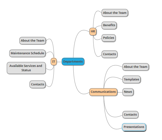
Here is what I mean by structuring content by Department:
In here, we see structure by department. Users are expected to navigate to a specific department and look for the relevant content there.
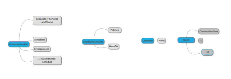
Here is an example of the same structure by Function. The labels here such as [Business Services], [Employee Services] and for illustrative purposes and we tailor those to your organization’s Functional areas:
Above, the content is structured by the Function, so that users can navigate to the area of their interest and find relevant information there without needing to know which team is responsible for the content.
Structuring solely by the department
Proponents say:
Everyone knows who’s content is who’s so it’s easier to assign permissions and find content
It’s traditional and simple, no brainer, HR stuff goes under HR, IT stuff goes under IT and so on
If we use functional or generic labels such as Business Services, users might find it confusing whether some content is business-related or employee-related
Issues:
New employees may not know which content is authored by which department
Example: Would an Expense Form live under HR or Finance? What about “Submit Travel Request“ - HR or Finance? How about “Templates and Samples” - this doesn’t seem to have a department
Content ownership sometimes changes by department especially when departments are renamed, merged or some subtle responsibilities change
Example: Emergence of the “Health & Safety” department, which didn’t exist before and some related “Health” content existed on the HR site.
How to categorize content authored by multiple departments? For example: “Policies and Procedures” are commonly owned by HR, Legal, Finance, and perhaps even Communications teams? Should then each department have a separate location for policies? What if you need to search across?
Get rid of department sites?
No.
So, what do you do instead?
It’s not that we want to get rid of the department sites altogether. They still have their purpose for storing information relevant to members of the department.
Below is the diagram to illustrate the difference between the information that should go on the department site versus the rest of the intranet.
But first, here is a 4-question tool that will help you determine the needs of the department and give them a correct response of what site to create.
See how in addition to keeping different type of content, department sites are restricted to members of the department where the rest of the intranet is available to everyone?
Let’s now see what are some of the sites under the company-wide part of the intranet.
How do you know what should go on which site?
The diagram above covers 60-70% of cases. But in an enterprise, you want to be sure, otherwise, your employees will complain that your new site is no better.
As a case in point, we did a recent study with one of the customers and here are the most common complaints we heard from employees:
The best solution is to verify your information architecture with a tree test.
How does a site tree test work?
When we design the site structure in the workshop we already have an idea of what we want the site to be.
Despite different opinions we hear in workshops, the sample size in a typical workshop is too small to make an accurate judgement of what is actually easier for employees. Workshops usually have 6-8 stakeholders and the average intranet can have anywhere from a few hundred to a few thousand users.
Now we just need to confirm whether our expectations match employee reality.
We usually build practical questions/scenarios, for example:
“You need to find out if there is a system outage with the CRM, where would you go to get that information“.
Then we give users our navigation tree and ask them to identify the item they think would contain that.
The test contains about 10-15 scenarios.
Since we’re using automated tools to run the test, we get interesting metrics, including:
What’s the first node in the tree users clicked on when asked for a particular scenario question
Going back to our example of IT systems outage, if they clicked on the Functional node, it gives us the quantifiable result of the first thought of where this information should be
How direct was their navigation when asked for a particular scenario
This tells us how much back and forth did they have to do before settling on an answer. Did they go down a correct path right away or did they have to backtrack few times
The more direct their navigation, the clearer are the labels which is good
What was nominated as a correct answer
… and was that answer correct
How long did it take for users to find the answer they consider correct
Longer times indicate a lack of clarity
Etc
“Why do we need to worry about navigation, don’t employees just use the search?”
This myth is very common, and it originates from the fact that most designers of intranet solutions are advanced users. As advanced users, we use online search a lot and we’re very good at it. We assume that the average user is also very good at it.
But in our mouse-tracking studies, we found that only about 15% of users use the search box and these are mostly advanced users. Others heavily rely on navigation and links to discover and find information.
“How many employees should I test this with?”
It’s always best to have a larger sample size when testing your Information Architecture tree. Definitely consider sending it to 10% of the company or more, if possible. Don’t limit the test only to people in the workshop since they’re biased.
In our testing, we test the IA structure, next day after brainstorming, and then collect and analyze results for the next day to finalize the tree. As a result, we get confirmed data in a matter of 2 days.
“Should I re-test?”
Often business is so satisfied with the clarify of the test results they get, they ask us “can we test it again and see the improvement“.
It’s normal. After you ran the first test, you might be tempted to make adjustments and re-test. This doesn’t work as well due to bias since your users have learnt something about the IA tree from the first time and the results would not be accurate.
There is also a factor of diminishing returns.
What we recommend now is using in-page analytics to see how users behave on the site rather than re-testing the site structure. In-page analytics will give you more detail on how employees interact on your pages, which buttons they click and how far they scroll. Be sure to get in touch with us, is this is something you’d like to do in your organization.
Can SharePoint Online hub sites help with the site structure?
SharePoint Online has a concept of the Hub sites allowing all of the intranet sites to be flat and tie them together in what’s called a Hub Site.
The idea is that site structure is then fluid and can be changed at any time to meet particular requirements.
So does this help?
Simply put, no.
If you change sites and links too often, users will be more lost than if you haven’t figured out the structure correctly in the first place, and let users get used to it.
Imagine the scenario where during the first month expense forms are under HR and next month, they’re under Expenses, then under Rewards & Benefits and finally moving to Employee Services.
In companies that are testing navigation on a live site like this, we hear this a lot from employees:
"It seems to be very hard to find something on the intranet. Once you get used to where it is they move it."
Conclusion
Despite the simplicity of structuring the content by the department, try to avoid this practice and structure by function. If in doubt or hear differences in opinions, run a tree test and let the results guide you.
What are some of the challenges you have seen when structuring content o the intranet? Drop a comment below, we’d love to hear from you.
Yaroslav Pentsarskyy is a Digital Workplace Advisor at Origami. He has been awarded as Microsoft Most Valuable Professional for 8 years in a row and has authored and published 4 intranet books.
Yaroslav is also a frequent presenter at industry conferences and events, such as the Microsoft SharePoint Conference and Microsoft Ignite.








Turn your SharePoint into a modern, website-like experience with no code using smart design tips and Origami web parts.