At Origami we love sharing intranet design examples!
Here is why.
A few years ago, our now-customer, reached out with an intranet Request for Proposal (RFP). As usual, we set up a call to learn more about their needs.
They opened their requirements document. “That looks familiar,” said our rep, as he saw parts of intranet examples from our blog posts in the requirements document! They said it saved them “a ton of time”.
And we hope this post will save you lots of time too!
We've put together a few of our favorite company intranet examples and intranet design best practices to help you come up with some amazing ideas.
Everything you see here has been put together with tools available in Origami and some design work in SharePoint. With a just little bit of content, you have a shiny new intranet design waiting for you.
Information Page
This simple yet common intranet portal design makes up most of the intranet pages. The main strength of this page design is its simplicity. Users expect to quickly scan the content for what they're looking for, and this design delivers just that very well.
Here are some common pages where you’d use a design like that:
About the Company
Description of the process
Employee handbook page
Individual guidelines & procedures
Employee benefits information
Knowledge Base Article
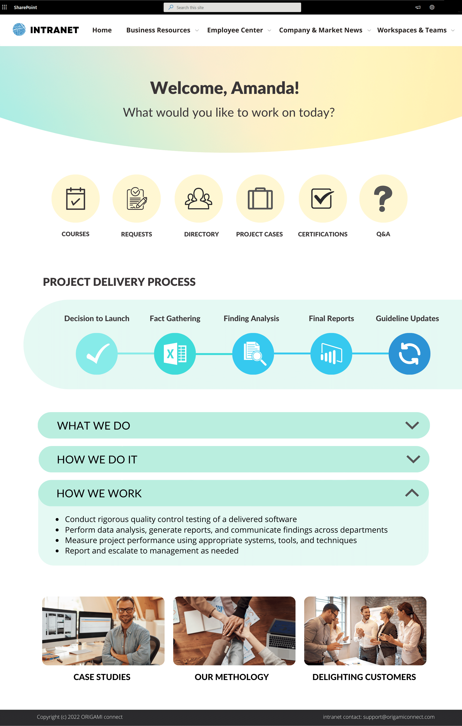
Here is an example of what an information page on an intranet portal can look like:
Intranet Design: Information Landing Page - clear headings and sections describe groups of content on the page. Set of links [Popular Content] helps users identify forms, templates, and other articles they may want to read.
The content in the example above is chunked into digestible pieces without overloading the page with text. You don’t want to have a huge block of text on the page because it might make the page look daunting.
Intranet Article Page
Department Page
Intranet design best practices call for two types of department sites:
Company-wide department page
For example, the new employee page where all new employees have access.
Internal department Team Site
For example, an accounting team site where only members of the accounting team have access.
Below we show an example of the Company-wide department page.
The Company-wide department page is there to provide resources built by a specific team or a department to the rest of the organization.
Here are some examples of these pages:
New Employee Onboarding Site
HR Information Site
Marketing or Sales Resource Site
Learning and Development Site
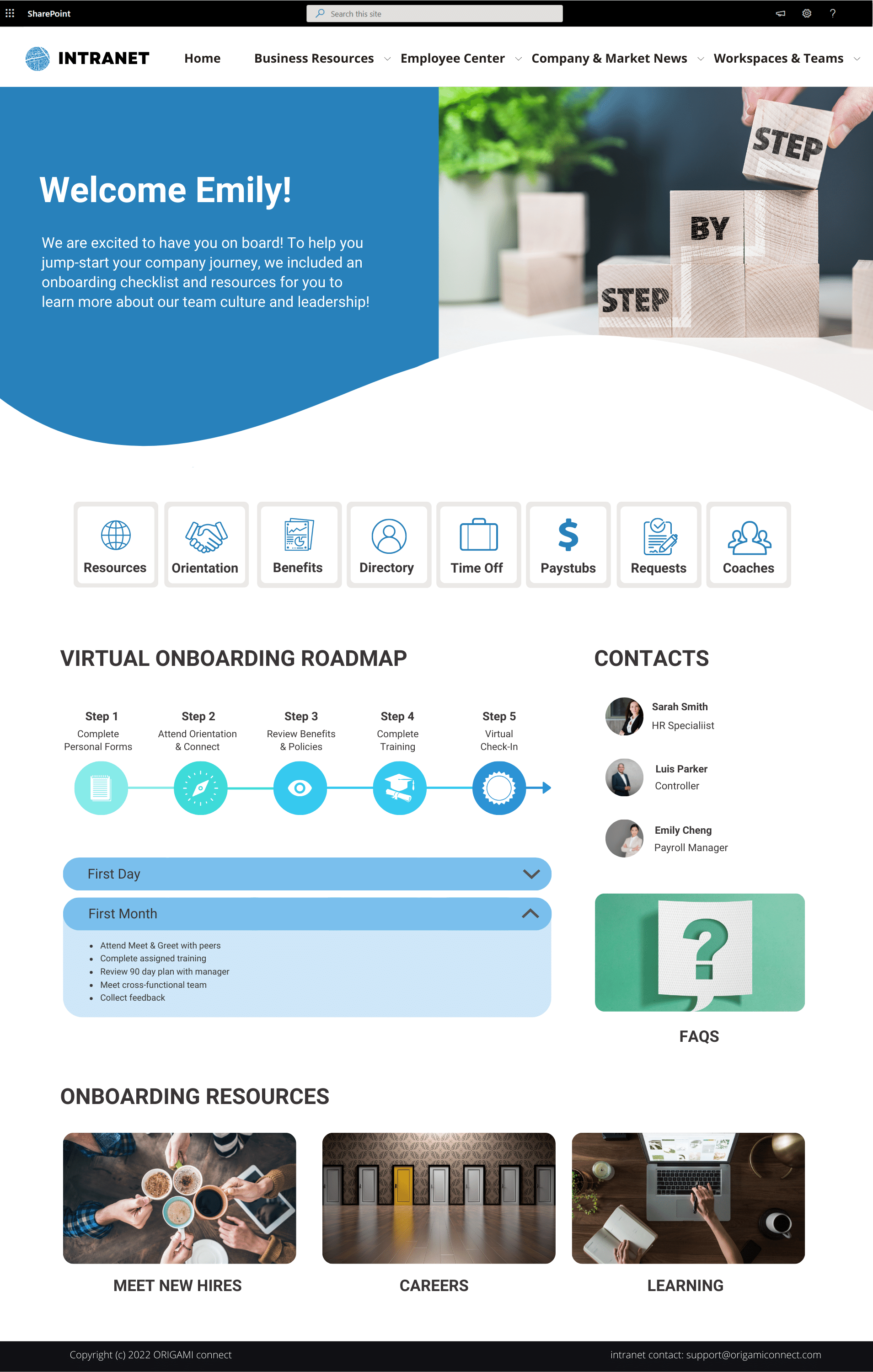
Here is what a New Employee Onboarding intranet page could look like:
Intranet Design: Department or Resource Site Landing Page - a place for staff to find resources produced by a specific team or purpose. [Featured] content at the top helps draw attention to the latest or most popular articles (see Information Page); followed by [In This Site] helping users to key content on the site. Contacts help find relevant site contributors; FAQ is also an easy way to answer popular questions.
This page uses the 2 column layout available in SharePoint out-of-the-box. It takes about 20 minutes to manually put together content on this page with a combination of Origami and SharePoint tools.
Forms and Templates Center
If there is one area each intranet should have, it's a place where staff can access forms and templates. These resources are essential to knowledge management and retaining organizational knowledge. If more of your staff can find relevant samples, the less work they need to do from the scratch.
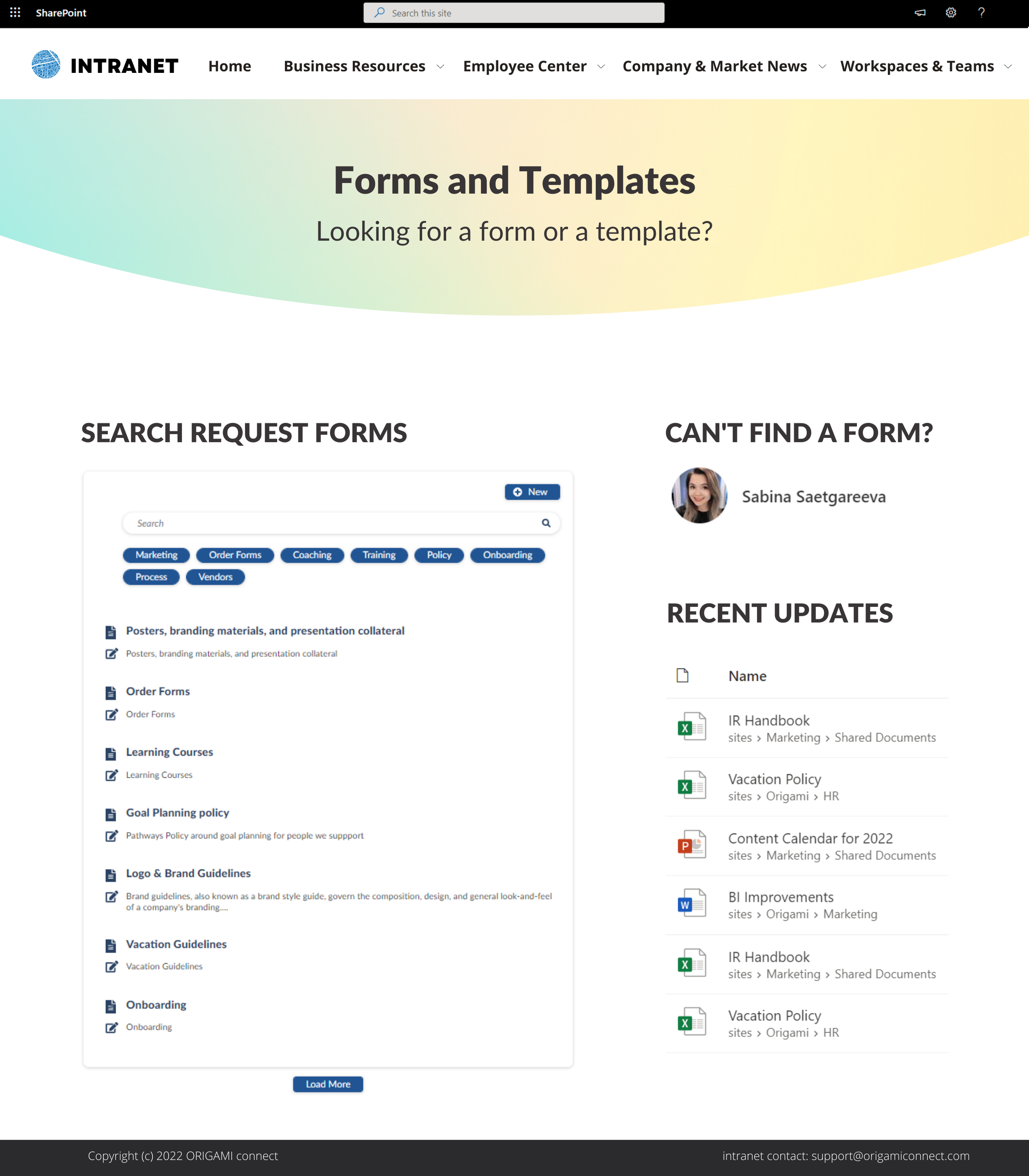
Here is an example of what a typical Forms and Templates site looks like:
Intranet Design: Forms and Templates Center - helps staff find relevant samples and forms. On the left-hand side - [Tags], allows to filter forms by relevant category. The search box and preview panel in the center allow you to quickly read more about the form before opening or downloading it. Contact person enables staff to quickly reach out in case the form doesn't exist. Finally, if there are any recently updated forms, they will automatically show up under [Latest Updates]
Here are the other types of sites which can be served using the Forms & Templates Center type layout:
Glossary Database
Policies and Procedures
Knowledgebase
The above template uses an Origami app connected to a SharePoint list allowing for approval of each template before it's published for everyone to see.
Projects & Workspaces
One of the primary objectives for any intranet is the ability to store documents and be able to find them easily.
Employees often tell us it can be a nightmare to find documents in SharePoint.
This is often due to how documents and other information is organized.
For example: let’s say you’re working on a project with one or two more members of the team. As you’re working on this project, you need a place to track tasks, so you create a task list. You may also need a place to save draft documents.
You might just put all this new content on your department site.
But wait!
What if employees use SharePoint search and your draft documents start coming up for them in search. This might cause a breach if your work is sensitive.
A better approach is to create a Project Site with restricted access so that only your team members can see it. Everything your team puts on that site will be automatically secured.
You can also make it easy for employees to access their team sites by using this intuitive team site directory as shown below.
Intranet Design: Project and Workspace Site Directory - allows users to quickly search and access the information they care most about. Personal favorites are displayed at the top. Project managers and authorized staff can create new sites.
Employee Engagement Page
Having a place on your intranet for employees to connect and share is great, but we found that dedicating an entire page to it may not have enough demand.
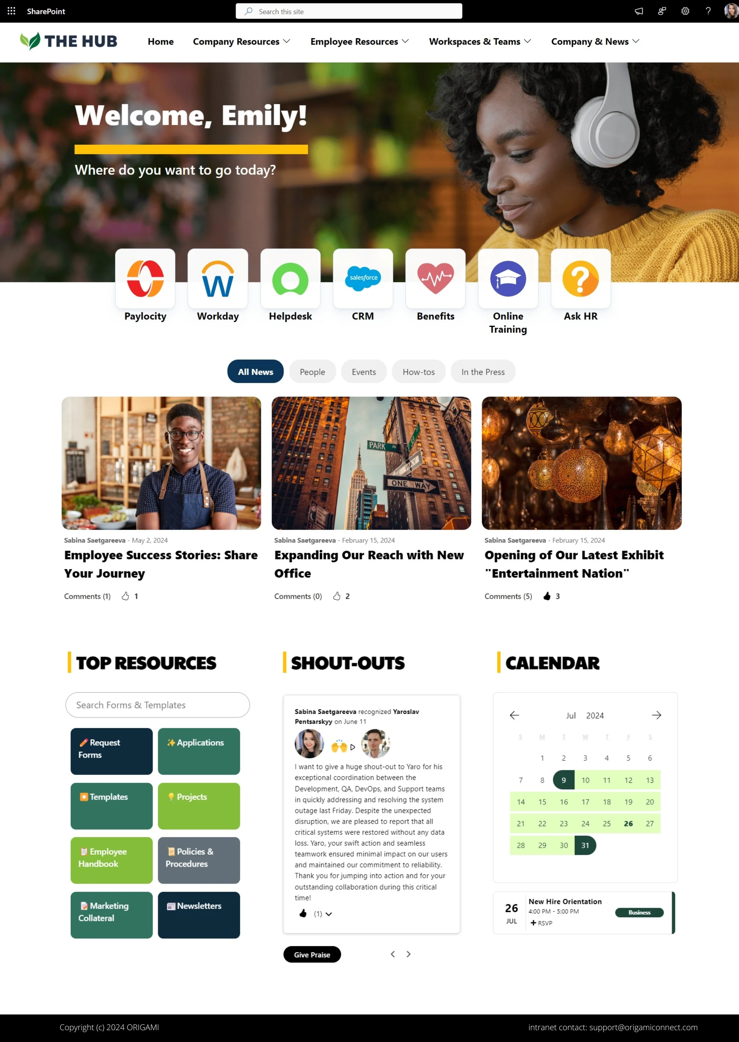
We recommend starting by adding a few engagement modules right on the company homepage. The example below shows a poll and shout-outs. Some organizations also like to use a bulletin board to let employees post moderated messages.
Intranet Design: Employee Engagement and Communication feature a distinct banner followed by a list of key links promoted by the company. [Quick Poll] will capture opinions on the latest hot topic and allow others to suggest a poll. [Recognitions] allow employees and management to nominate others for a job well done.
All components on this page are built on top of SharePoint, so you can always enable approval or alerts to manage content before it's published. Whether it's a new idea suggestion or shout-out, managers can turn on auto-approval or moderation depending on company policies.
Thanks for making it this far.
If you have an existing intranet needing an upgrade, be sure to get in touch with us and we can help you create personalized designs just for you.
Make your intranet beautiful and website-like, without coding!
Yaroslav Pentsarskyy is the Director of Product at Origami. He's also 8 time Microsoft MVP, speaker at many local and worldwide tech events, and a published author of several SharePoint related books.


See how we turned a default SharePoint homepage into a modern and stunning landing page.