What if you could create your company intranet all over again? How different would it be?
Which parts would you keep, and which ones would you drop?
When we set up a new intranet for a customer, we collect what we call a “page heatmap”—it shows us which parts of the page get clicked the most and how far down the page people scroll.
Knowing this helps us see which parts of the page users find the most valuable so we don’t spend time on the wrong things next time.
For this post, we’ve compiled six best company intranet examples built on data collected from hundreds of intranet sites!
With these intranet best practices and design ideas, you can build impressive pages quickly.
Let’s look at these modern intranet examples now!
What are company intranets, and why do employees love them?
Unlike email and instant messaging, a company intranet is a central source of truth for things like company communication, forms & templates, policies, and procedures.
Let’s face it, without a central place like an intranet website—employees would wander around company chat channels trying to find the same template for the n-th time.
That’s frustrating for new hires and annoying for senior employees.
What content should be on a company intranet?
Every business is different, but here are things almost every intranet has
Corporate news, alerts, KPIs, and leadership communication
Links to most used applications
A place for new employee onboarding
Benefits and payroll site
Forms, Templates, policies, and Procedures
Employee directory
Learning and development section
You will find more company intranet content ideas and inspiration in the video below.
Watch this video to see tips for creating a killer employee intranet in 2024 and our latest company intranet examples.
Company Intranet Examples
1. Corporate Intranet Portal homepage
Of all the company intranet website page visits, almost 80% are to the homepage. This number is high because many businesses make their intranet homepage a default page when employees open their browsers.
So, what does that mean when you build a new company intranet?
Since so many people see the homepage, avoid making it merely a placeholder or another hoop to jump through to get to where employees need to go.
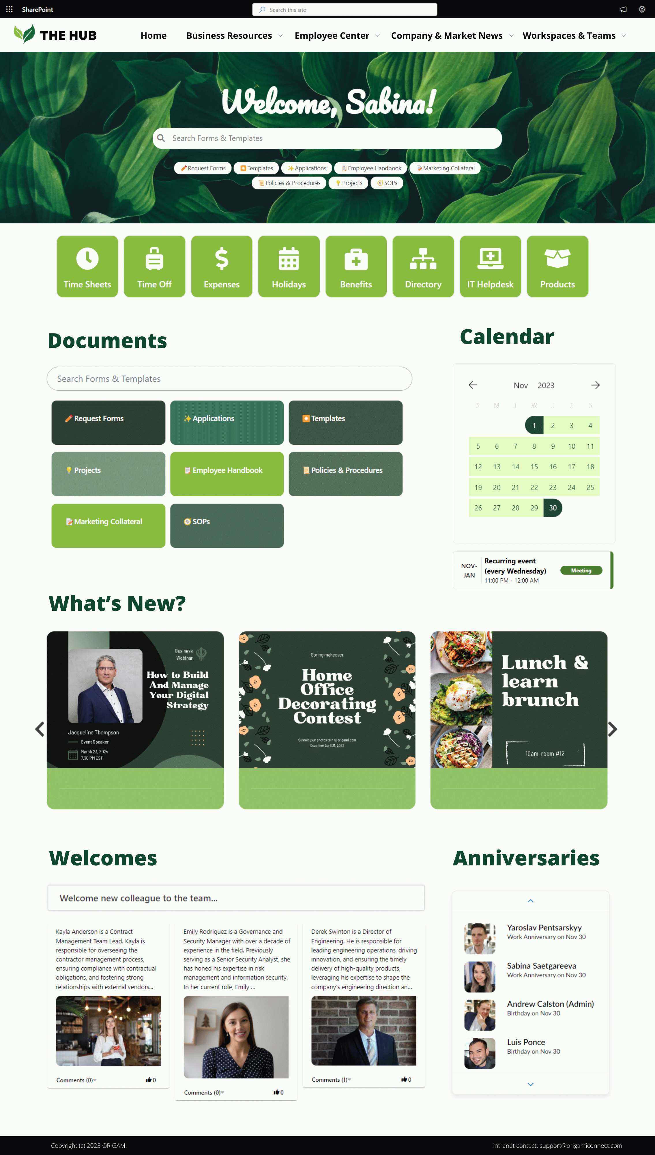
Let’s take this company’s intranet homepage as an example.
Why do employees love this homepage on a company intranet portal?
The news banner is not just some generic banner—it calls employees by their name, making the message appear more personal while keeping the same news content for everyone.
When employees see a personalized message on the banner, it makes the message sound more relevant:
“Jack, did you hear about our recent expansion strategy?”
As opposed to this news message
“XYZ company expansion strategy.”
Quick links to the most used company applications are right at the top of the page, making it almost like a list of universal bookmarks.
The resources carousel creates a Netflix-like experience so employees can browse key intranet pages. These resources can link to external sources (like a press release), or news posted on the intranet.
Overall, the page uses a rounded corner style to create a softer and more modern intranet look in line with how content is presented on the web.
Let’s now see a few industry-specific company intranet pages.
2. Payroll and benefits page example
The payroll and benefits page is the second most visited page on the company intranet. It helps answer questions about compensation and rewards, policies, holidays, and performance.
If your company uses separate applications for time tracking, expenses, and vacation booking—you can link to those applications from the payroll and benefits page.
Here is an example of the payroll and benefits page.
Why do employees love this employee benefits page?
Beautiful design helps organize information clearly and succinctly
HR professionals don’t have time to design intranet pages, so HR pages can often look very basic
Having an attractive template can save time for HR generalists
Instant access to paystubs, employee benefits resources, timesheets, and employee handbook
A calendar with a pay and holiday schedule decreases payroll-related emails
A feedback box at the bottom of the page ensures that this page has all the information employees need and it evolves with time
3. social intranet
Here is the video of how we’ve built this landing page from scratch.
4. Financial company intranet
Credit unions, private equity and investment firms, banks, and insurance organizations are just a few finance organizations that:
Employ many professionals
Are subject to frequent economic, regulatory, and policy changes
Require advanced security best practices to comply with regulations and insurance requirements
This calls for a corporate intranet that’s easy to update and safe whether the staff works remotely or at the office.
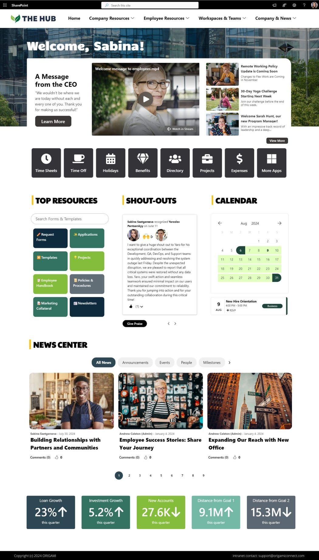
Here is a good example of a company intranet homepage for the financial industry:
Why do employees in financial services love this company intranet page?
A personalized welcome banner makes this page feel relevant to employees that often work remotely. This banner can be a rotating carousel to promote announcements.
Links to frequently used applications at the top of the page serve as a gateway to other tools employees often have to bookmark
Easy access to corporate policies and procedures
A summary view of portfolio performance and KPIs helps keep an eye on the target in rapidly changing markets
An interactive news center contains the latest company leadership and strategy updates without cluttering the page with too many news posts at once
Video content helps see short leadership and industry updates
5. Healthcare Company Intranet Portal
Healthcare organizations also employ a large workforce. Staff members in administrative functions have a desktop, but most employees who are not in administrative roles don’t.
Healthcare company intranet needs to accommodate these two very diverse types of employees.
Let’s look at a good company intranet example below.
Why do healthcare employees love this intranet portal page?
A bold, website-like banner makes the page look modern and adapts to mobile devices so desk-less employees can stay in the know while on a phone
Administrative employees have access to their most commonly used applications, while line staff have their own
Interactive media content will engage employees who often have limited time in their shift to keep up to date with changes
Polls will help employees be a part of the organization-wide conversations with minimal effort
A widget with shout-outs is a must-have for a social intranet. It will help healthcare workers be recognized for their work, boosting employee morale
These were three examples of home pages.
Let’s now see other types of company intranet pages for:
Onboarding
Payroll and Benefits
Learning and Development
6. Onboarding page example
Having an onboarding page on your intranet website is a must.
The HR department will save countless hours responding to new employee requests if they have a single place for new employees to learn:
The basics about working at the company (things like booking meetings, setting up voicemail etc)
What to expect at various stages of their employment
Whom to contact for questions
Se who else has joined the company
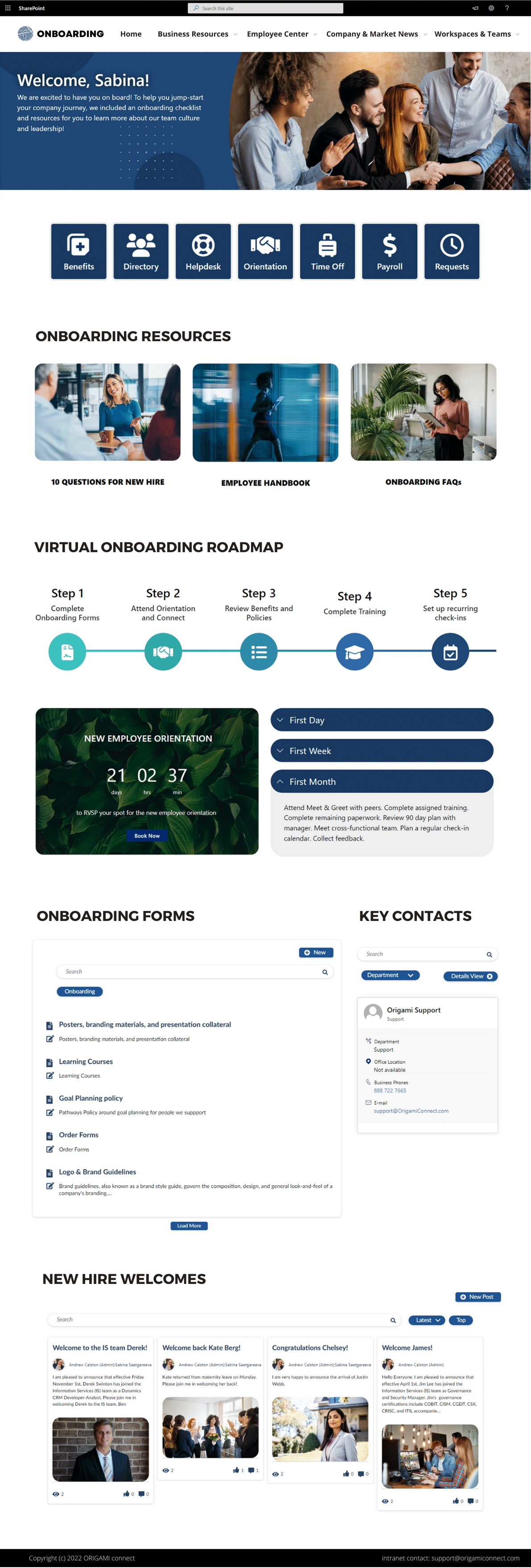
Here is a modern intranet example of a good onboarding page that gets 5 stars every time we set it up.
Why do employees love this onboarding page on a company intranet?
Personalized banner will make new employees feel like it’s the welcome letter personally addressed to them
Quick links give access to key HR onboarding resources, like handbooks, a way to book time off, a way to access the paystub etc
Progressive timeline help break down the onboarding steps and optionally can give links to key resources for each step
Collapsible sections help understand what to expect in the first months of employment
Countdown timer reminds new hires to book their upcoming check-ins with the manager
Onboarding forms help find onboarding-specific resources easier. These forms can be elsewhere on the site and are filtered here for easy access
If new employees have questions beyond what’s on the onboarding page, they can reach out to key contacts from the employee directory
Welcome corner will help connect with new joiners
7. Learning and Development page Example
The learning and development page can look different depending on whether your organization uses a learning management system (LMS).
If you do use LMS, then this page may have mostly links to job descriptions, courses, learning requests, career paths, and certifications.
If you don’t have an LMS, this page can be more comprehensive and have courses, videos, and surveys to track the completion of required learning.
Here is an excellent company intranet example of the learning and development page.
Why do employees love this learning and development page?
The page is targeted to a role so employees can get personalized course recommendations based on what role they are in
The personalized banner nudges employees to select from the available actions. This saves time scrolling down just to find out that what you were looking for is not there
Beautiful bright design makes the page look modern
Interactive video carousel shows relevant courses without overwhelming users with too much content
Follow Intranet Design Best Practices
Create user-centric navigation
When searching for content, employees don't immediately think about what department created that content. If your navigation shows a list of departments, employees may need to click multiple department pages before they find what they are looking for.
This can make things hard to find.
If your navigation is structured by function, it is more user-centric and easier to understand.
Keep intranet navigation simple and to the point
When creating navigation labels, keep them simple.
Creative label names like "In the neighborhood" or "Daily Pulse" sound nice, but our analytics show that many employees don’t know what's under them, and only about 2% of employees click on them. Renaming these with clear and descriptive labels (ex.: Onboarding, Benefits & Payroll ) will get you better engagement and ease of use.
Make your homepage shine
Your modern intranet homepage is like a movie trailer, the first few seconds will make an impression whether anyone wants to see more. So make sure it creates a great first impression. A clean, modern layout can go a long way in boosting employee engagement and intranet adoption.
Personalize your pages by greeting employees by their name
You might have heard of an old saying, “A person's name is the sweetest sound to them,” and it’s true even when it comes to your intranet pages. Personalized welcomes make your intranet look more relevant to employees, and they are more likely to pay more attention.
Use image rounding to give your intranet a modern look
Rounded corners are everywhere: in your mobile apps, on the web, and even on many billboards. Using rounded images on your intranet will make it look more modern and familiar with what employees see everywhere else.
Use your brand colors on pages
Give your intranet site an extra splash of personality by adding your company's colors! Not only will it look fresh, but it'll help create a unified and memorable experience for employees that will perfectly reflect your company culture.
Avoid copying famous intranet designs
As tempting as it may be to copy another design, do it with caution. Some companies fall in love with beautiful designs but may have no one to maintain them. If in doubt, ask yourself: (1) is there evidence my employees need this functionality now (2) do I have staff to moderate and maintain this page? At Origami, at the beginning of each project, we have a design workshop to help clients pick what functionality will come out immediately and which will come out later.
Improve Adoption with Intranet Must-Haves
Show links to frequently used resources and applications
Just like on a restaurant menu where featured items show top dishes, on your intranet, quick links help employees access the most used content in a single click. You can include links to enterprise applications, such as timesheets, employee directories, frequently accessed templates, etc.
Show only relevant company news and events
As our attention span only gets shorter, many internal communications get ignored. To solve this problem, you should target content to different employee groups. Most modern intranet solutions allow targeting news and events based on location, role, or security group.
Make your search easier
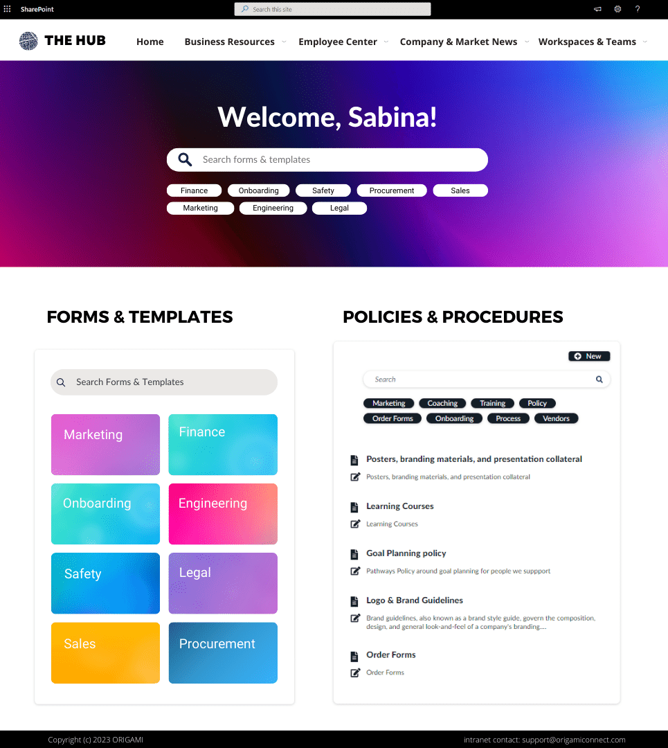
Searching and not finding is a pain. Why can’t searching on a modern intranet be as easy as Google? Three out of four employees search for forms, templates, and policies. So make those resources instantly visible before anything else. Keep them separate from all the other content on the intranet, and employees will find what they're looking for in no time.
Make it easy to find colleagues with an employee directory
Employee directory is one of the top 3 resources employees use most frequently. It’s a must-have. It makes connecting with colleagues and experts from other departments easier, especially for new employees during virtual onboarding.
Keep everyone in the loop with a company calendar
A company calendar helps track important events like team meetings, holidays, and deadlines in a single place. Keep your team in the loop and on the same page!
Celebrate and recognize your team
Welcome new employees, recognize staff achievements and call out milestones to keep your employees connected. Employee recognition can do wonders for your company culture. You'll create more meaningful interactions between your staff, which can promote sharing and help your organization grow!
Make urgent alerts look prominent
If there’s an outage or urgent event, like severe weather, or a security incident affecting company offices or a location, it’s important to make this information look more prominent on your intranet. You can use different colors to reflect the severity of the alert.
Create a brainstorming corner
What if you could turn a water cooler into a well of ideas?
Use a virtual bulletin board to help employees pitch ideas for new products, improvements to existing processes, and even tips from senior employees to new joiners. This will engage employees in a remote workplace and grow collective knowledge and company culture.
Get your team's opinion on crucial company decisions with polls
A simple poll can help you understand how current policies or changes impact your staff. Well-crafted questions can also boost employee engagement. Get creative, and you can tap into employee sentiment in no time!
Post videos of recorded meetings and townhalls
Multi-media content is excellent for employee engagement! These videos will provide a recap for those who couldn’t make it to the meeting and make the intranet experience more interactive for everyone.
Showcase numbers that matter
Share dashboards with key metrics. This can cut the time of finding these numbers in analytics platforms and keep employees aligned on high-level goals. With Origami, you can embed any dashboard from Tableau, Power-Bi, or Google analytics, like in my example below.
Don’t forget the FAQs
Having an FAQ section on an intranet can be especially valuable for companies with many new hires. It can help new employees get up to speed faster and reduce email overload during onboarding days.
Update new content regularly to keep things fresh
Your internal communications are relevant only when they are fresh and up-to-date. Keep your intranet vibrant by regularly adding new content. With regular content updates, your intranet will become the single source of truth that your employees know they can trust!
Delight frontline workers with an exceptional mobile experience
Make your intranet site look great on mobile. This is especially important for industries with many frontline workers, such as manufacturing, retail, and real estate. A user-friendly intranet for frontline and remote workers will create a more inclusive company culture.
Ask for feedback
The best way to know what your users think of your intranet is to ask them. Encourage employees to share their feedback on your most popular intranet page. Gathering regular feedback is key to understanding what works and what doesn't, so your intranet can evolve and stay fresh for years to come.
Boost Employee Engagement with Analytics
Measure adoption with analytics
As mentioned at the beginning, when we set up a new intranet for a customer, we collect what we call a “page heatmap”—to see how employees interact with key pages. Based on the usage information, after some time, you might want to adjust the page for better user engagement. That will make your intranet more helpful to employees.
Track what people are searching for and not finding
See what intranet users are searching for and not finding to get a better understanding of the content your intranet needs. Once you know what needs to be added, do it, and watch how quickly employee opinion of your intranet solution changes when failed searches become successes.
Track times when employees are the most active
Schedule your internal communications when employees are more likely to engage. If you posted a news article on Monday morning, it doesn't matter that employees receive a notification. Mondays are busy! Employees will likely ignore your post unless it screams urgency.
But what if you posted it right when everyone is active, not only you'd get a lot of views, but you’d also get a lot of employee engagement! For most of our clients, 7-8 am on Tuesday is when their users are the most active. So, those are the hours we would use to post content.
Improve Stakeholder Buy-in
Identify business problems your intranet will solve
Common mistake organizations make is asking employees about the specific features they want to see on their intranet. This sometimes turns into a laundry list of cool technology widgets employees saw on the web. These widgets might be expensive to build and rarely used by the entire company.
While it is important to know what exact capabilities the intranet should have, it is even more important to know what business problems employees want to solve with these features. Knowing the business goal behind a request will help you select an alternative that fits the bill.
For an intranet to be usable, it should always account for users’ end goals. This can help in the creation of user-centered requirements and will make the software selection process more flexible.
Because the intranet is just one component of a digital workplace, it is also possible that users’ end goals may be achieved with existing systems. By identifying problems intranet solves, it will be easier to see how the project fits within a company’s strategy and a digital ecosystem.
Engage executive team
At Origami, we found that employees spend more time on an intranet when there are regular communications from executives.
This is why it is important to involve leadership from the get-go.
To get executive buy-in, tie intranet goals to executives’ strategic initiatives and share employee stories backed by company numbers.
For example, our customer executive wanted to improve the visibility of Safety in the company. We proposed to create a Safety section on their intranet with key metrics, employee best practices, and standards. This improved the visibility of Safety standards in the company, increased awareness, and brought a personal touch to safety directly from employee stories and best practices.
Targeted, data-driven storytelling will make the case more persuasive, and leadership will want to engage in the project going forward.
If you want to make it easy for management to get involved, give them the plan to make the intranet successful. This will save them time coming up with their own ideas and help them to contribute content employees want to see.
Assign content owners
For the intranet to be fresh and up to date, it's essential to have a content owner assigned to each key page. This will ensure that there is always someone accountable and will prevent diffusion of responsibility as the intranet grows.
Provide training for an intranet software
Another way to increase employee adoption of your company intranet is to provide training for the entire company. Many employees may be hesitant to use intranet software because they are unfamiliar with how it works. By providing training, you can help employees feel more comfortable using your intranet solution and increase their overall satisfaction.
High-value vs. low-value intranet activities
How do you maximize the time and budget you spend on your intranet project?
When re-designing or building a new intranet, it’s easy to fall into the trap of low-value activities—building web parts and writing code that does basic functionality and makes the page look good.
These activities are low value because employees take them for granted.
Employees often assume you bought a tool and it took you no time at all to make those pages look great. They’re often shocked you spent time building things from scratch.
So where is the value then?
The value is engaging with employees, leading them through change, and co-creating the intranet with them, not just handing it down to them. And, how can you find time co-creating and leading when it’s spent on commodity activities?
At Origami, we use Design Thinking—the approach to facilitate and structure co-creation and a set of tools to make beautiful designs like the ones you saw above. Get in touch with our enterprise architect for a consultation!
Sabina Saetgareeva is a Digital Marketing Specialist at ORIGAMI. She helps infuse ORIGAMI brand with what customers need and seek. Sabina is an avid reader of the future of work, digital transformation, and trends in Digital Employee Experience.


