Everyone loves interactive design sessions when building an intranet or any web site for that matter.
What can be more fun than a bunch of co-workers taking practically a half-day out from the regular routine to try to build something new. The possibilities seem endless and so is the fear in the eyes of project managers. We all know what we're afraid of ... this ->
This is actually a foam core board to which we attached pretty much every intranet feature we had available on the menu. This is something we hope your intranet doesn't look like and every time I run a workshop I do also hope that's not what will end up on a customer's site.
So how do you help your workshop participants with picking less items on the menu and thus keep the intranet scope in check?
Many workshops start with a blank sheet of paper but then very quickly it gets to this question: "well, how difficult is this?" or "can we swap this for that?".
My favorite method is to briefly estimate the time and resource effort required for each feature in advance of the workshop. This doesn't have to be anything complicated, just a standard Small/Medium/Large is adequate to facilitate the discussion.
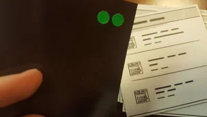
In here you can see I've color coded the back side of the component so I know how "heavy" it is. Another thing you can do if you get a lot of those "how difficult is this?" questions is to tell you participants about the code on each component so they are aware whether they can trade one component for another.
It sounds like a game, but it works - people like to be in the know and feel engaged. Plus it's much better than going to the intranet developers each time you finish a workshop to find out it’s not within budget.
In some cases you may not have all of the components available because your workshop participants come up with features or integrations you haven't thought of. That's ok, you can use an empty sticky note to briefly describe the component and assess it's complexity without rush later.
Also, chances are your participants will take one of your existing components and change some functionality in it. In the example here on the right I have color coded additive changes (where new functionality is added to an existing feature) versus when the feature I have estimated has been simplified. This also gives a quick view of how your wireframe is progressing in terms of complexity.
This simple enough approach will get you the best results for your intranet scope and your workshop participants will feel like they have not only designed the system but also gain an understanding around the complexity required to build it.
Try it next time and let us know how it goes in the comments below!
We’re here to help
If you have questions on how to make your intranet more engaging while leveraging your existing Office 365 and SharePoint investment, we’re here to help you make that impact.
Yaroslav Pentsarskyy is the Director of Product at Origami. He's also 8 time Microsoft MVP, speaker at many local and worldwide tech events, and a published author of several SharePoint related books.


We've put together several of our favorite SharePoint site examples all built using Origami to help you come up with some amazing ideas! Learn the essential components for great intranet templates today!