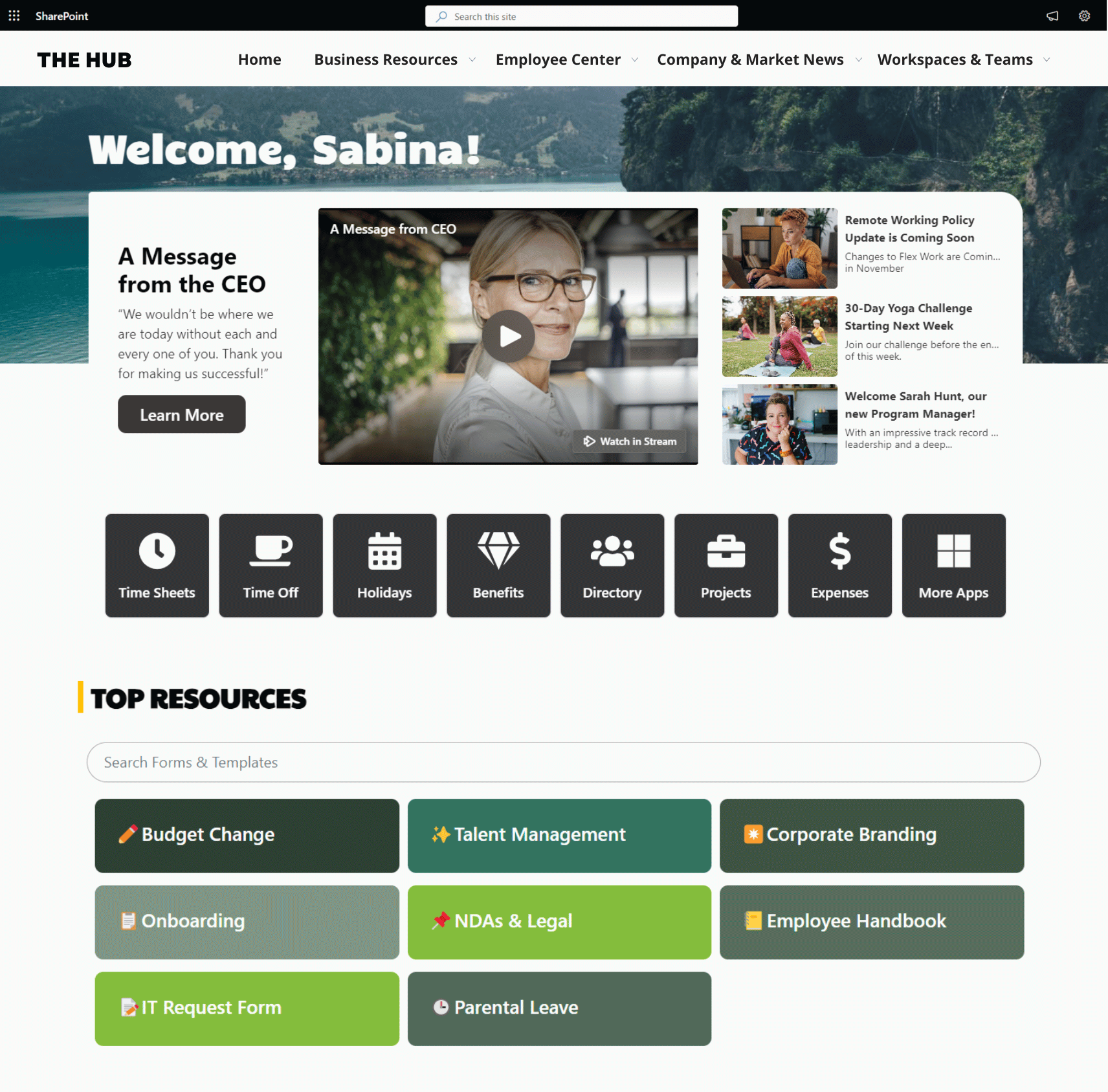
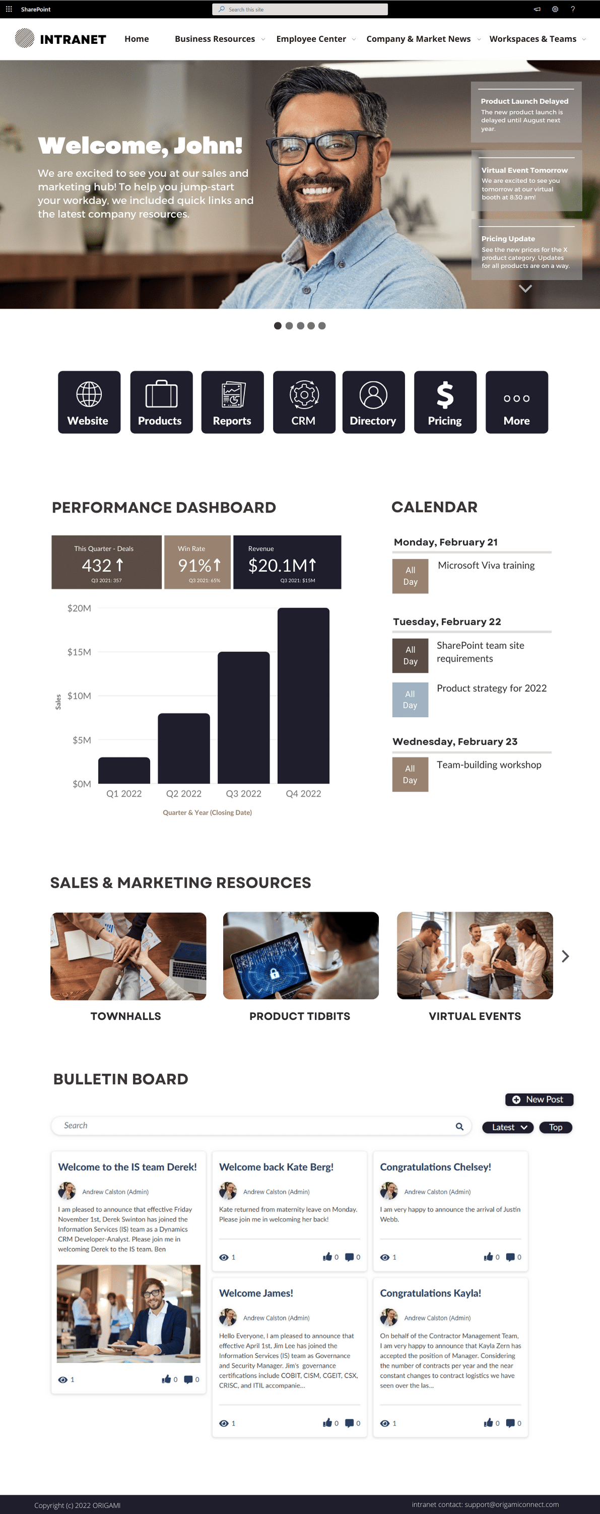
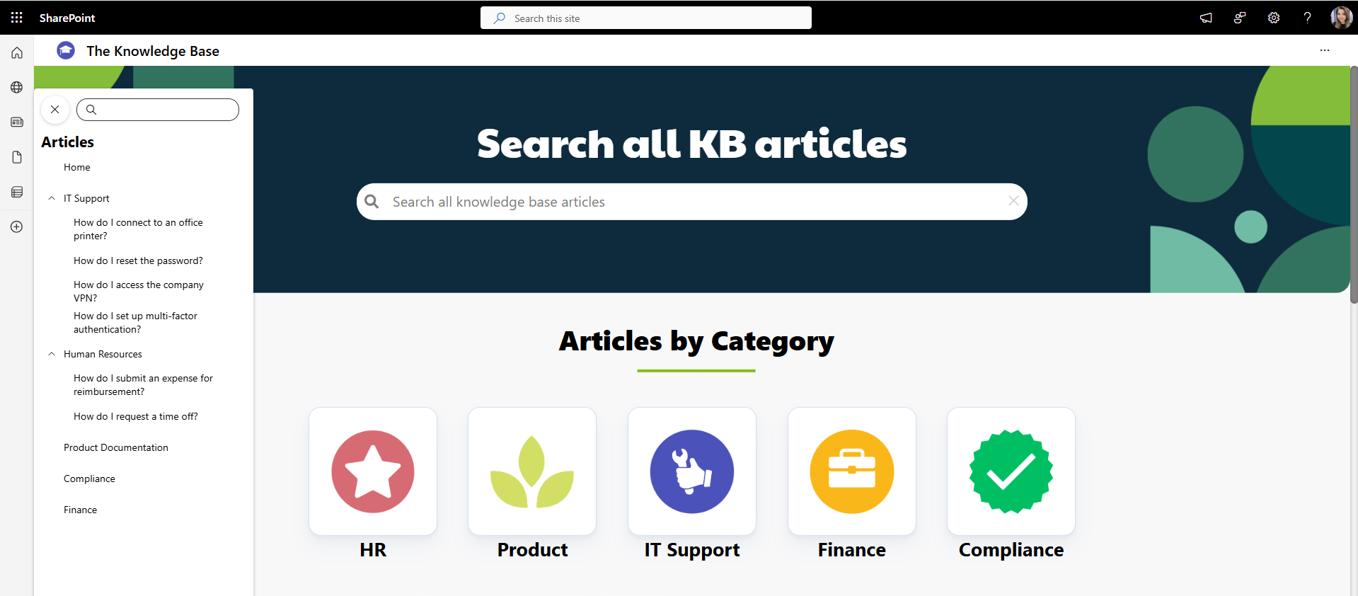
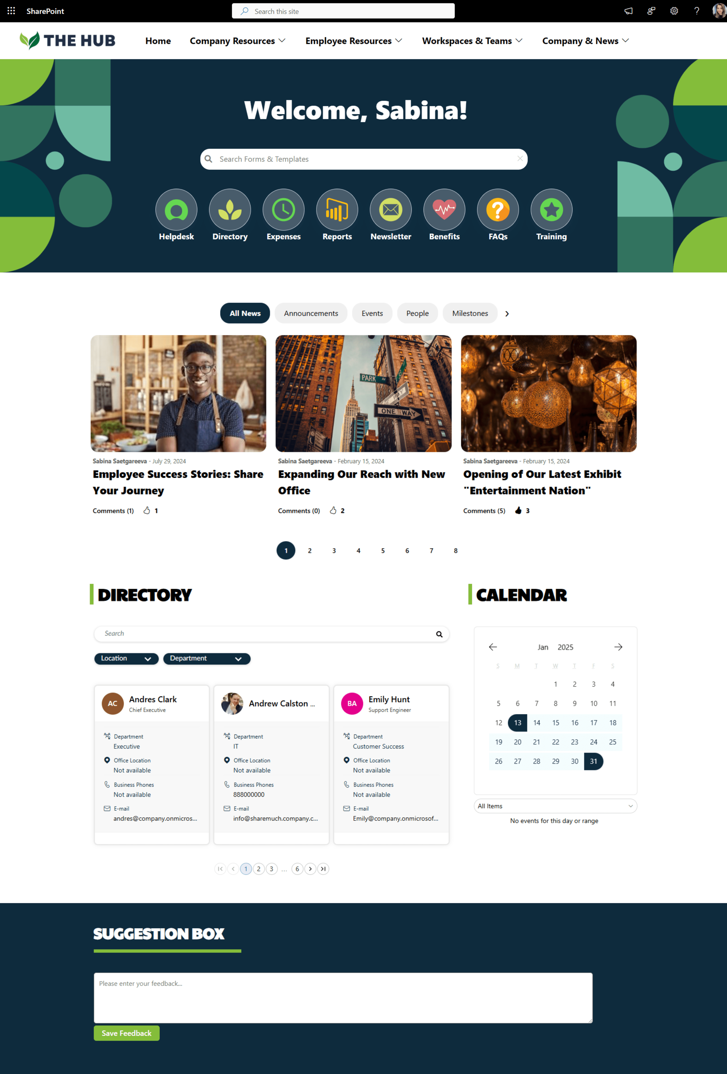
Get inspired with six company intranet examples built on data collected from hundreds of intranet sites. See intranet best practices and design ideas to help you build an intranet employees will love.
15 Modern SharePoint Intranet Site Examples for 2024
SharePoint Knowledge Base: Top Examples and Best Practices
20 Killer SharePoint Design Tips for 2025
7 Great SharePoint Site Templates
7 Stunning SharePoint Design Ideas to Inspire You in 2025
6 SharePoint Intranet Examples and Templates
5 SharePoint Communication Site Examples and Templates
How to Create and Customize a SharePoint Site: A Step-by-Step Guide
4 Key Elements of a Great Intranet Homepage Design with Examples
The purpose of the intranet homepage is to provide quick access to what employees need most. This includes: apps and tools employees need most frequently, critical communication, stats and performance at a glance, and easy navigation to get to more resources.
What you’ll see here are the things you can do TODAY to make your homepage POP and create an experience your employees will value.
How to create a killer HR Portal SharePoint site? 3 Examples and Templates
The most successful HR portals have the tools and resources to cover all three categories of employee needs.
When you organize your HR portal in a way that matches employee needs, essentials first, at the top of the page, available with minimal effort, followed by other needs in order of importance, employees will find your HR portal useful, intuitive.
Let’s get more specific.
How much will your new intranet really cost?
SharePoint Best Practices for End Users: 23 Tips and Tricks
We’ve all been there.
You start using SharePoint, and you finally feel like you’ve got the handle on it. And then, someone at work points out an issue, and you go online, search for it, and find another way to do things you didn’t know existed.
Now you’re wondering, is their way the “right” way? Did I do it “wrong” before all along? Do I have to re-do everything?
What is the right way anyway?
SharePoint Search Guide: Tips and Tricks
Before hiring a SharePoint consulting company, read this
SharePoint Lookbook: Everything You Need to Know
What is SharePoint lookbook?
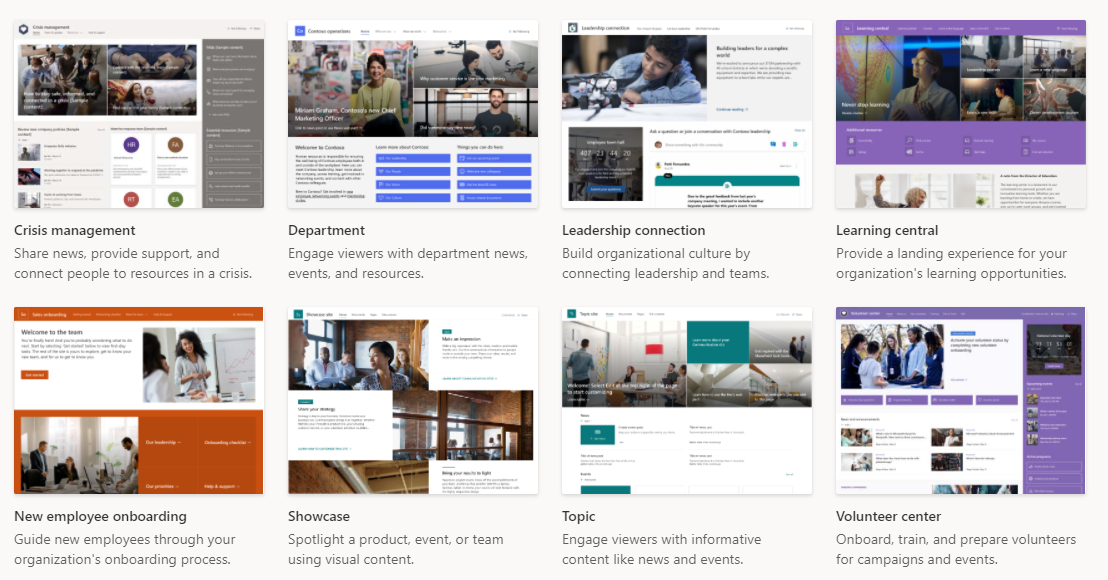
SharePoint lookbook is a basic gallery of designs that works great when you need a:
Where do I find SharePoint templates in lookbook?
You can browse the list of available lookbook templates here: https://adoption.microsoft.com/en-us/sharepoint-look-book/
You can also see the same templates when creating a brand-new site in SharePoint.
What kind of templates are available in the SharePoint lookbook?
Lookbook gives you some of the most common page templates, including:
Landing Pages
Department Sites
News Sites
Onboarding Sites
Learning & Training Sites
And more
Who can create and use lookbook templates?
You must be able to create SharePoint templates from the lookbook in your tenant.
This required permission is one of the highest access rights in SharePoint Online. If you work for a larger organization, you will need to speak with your IT department to have the site created for you.
How to download Microsoft lookbook templates?
To download and install a lookbook template, follow these simple steps:
First, you must be a tenant administrator in your SharePoint Online tenant, as noted above.
Select the lookbook gallery template you like by going here: https://lookbook.microsoft.com/
When ready, click the [Add to your tenant] button
Choose the following:
a. Email
b. Site Title
c. Site URL
Click [Provision]
Wait a few minutes and then navigate to the site URL you chose. The template should be ready, just as seen in the picture.
How to use SharePoint lookbook templates?
When you download and install your chosen lookbook template in your SharePoint tenant, you'll immediately have access to a landing page you can edit.
Simply edit the page and add/remove or update apps as needed and preferred.
Here are a few things to remember when working with a sample site from the lookbook:
Remove all sample pages
Some templates in the lookbook, such as New Employee Onboarding, come with several sample pages you'll want to remove. Sometimes we see these pages left behind, and employees stumble upon them in search results, thinking it's trusted content when it isn't.
Replace or remove sample content on the page.
This might be obvious, but we've seen customers leave parts of the demo site on the page, confusing to everyone who thinks it's actual content. This includes images of look-alike reports, tasks, and diagrams.
Delete sample PowerPoints, documents, and sheets that users might find using search.
Give site permissions
Each time you install a lookbook template, SharePoint creates a brand-new site.
Sites in SharePoint require explicit access; otherwise, no one will see them and be able to use the valuable information. This rule goes for every template you download from the lookbook.
Delete sites you tried and didn't like
Since SharePoint makes a new site each time you try out a template, we recommend deleting sites you tried and don't like to avoid confusion with real sites employees will use.
What are the pros and cons of the Microsoft lookbook?
As we shared earlier, the lookbook is excellent for practice/training, showing a prototype to others, and jumping-off points for beginners.
Here is a more detailed Pro/Con list.
Pros:
It can be installed in minutes
That's right! Templates can be installed in your tenant in just under a few minutes. If you need to train your users on using SharePoint, you can quickly create a ready-to-go site in minutes. This is a massive improvement compared to making pages from scratch.
No code is required to install the site.
Anyone can install a template as long as they have permission to do so—no need to hire a developer or write code.
If you're practicing your SharePoint skills, you will immediately know what is possible to build out-of-the-box without needing to customize anything.
Ready to click on examples to show your team
Instead of showing your team pictures of potential page designs, you can show them working pages.
Cons:
Limited options for branding and basic design
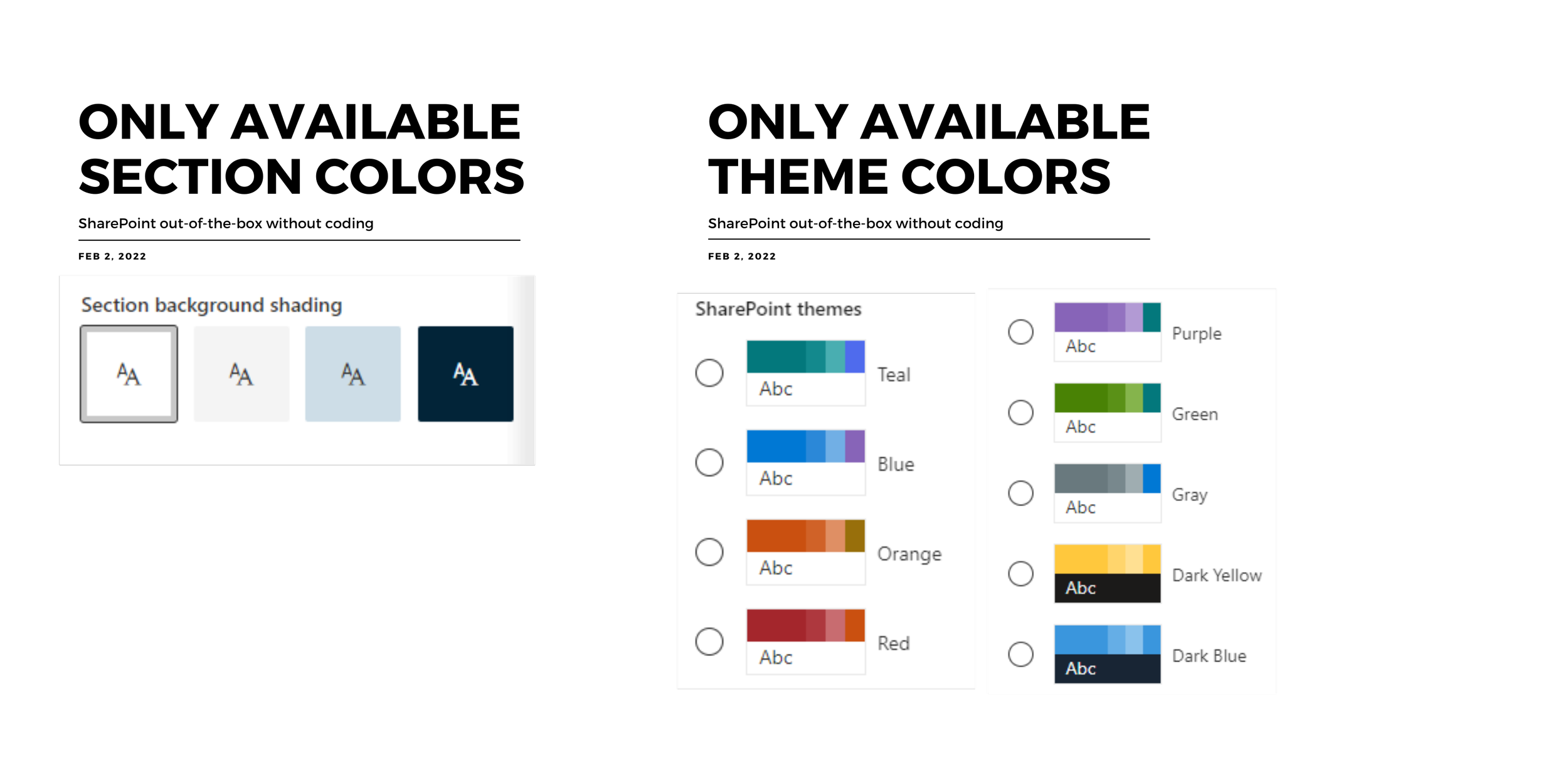
Fixed color combinations
There are limited color combinations in SharePoint (known as theme colors). This means you can't customize the site and page colors to match your corporate style guide without writing code.
Fixed font and iconography
The only font available without writing code in SharePoint is Segoe UI, with fixed sizing and color options. This breaks most of the corporate style guides.
Image-heavy designs
When you zoom in on lookbook designs, you'll see many page elements are images. This makes the page look colorful but may lack valuable tools for employees.
Limited app choices
Many images in lookbook templates can catch your eye, but as you start adding apps, you may find that your choices are limited and the page looks bland.
Limited page sections
SharePoint allows you to break the page into sections. However, you have limited combinations of sections and apps to choose from out-of-the-box.
Many organizations find these constraints limit their visual design requirements.
You can't add an individual lookbook page to your existing intranet
Each SharePoint online lookbook template is a separate site, so you can't selectively copy it if you like just one page. You have to create an entirely new site with that chosen lookbook template. Many companies see it as overkill and a permissions management nightmare.
Not an intranet template
Lookbook is not a pre-built intranet; it's a gallery of visual design samples (a collection of standalone pages).
If you're building an intranet, you'll need to tie these pages/sites into a user-friendly structure so employees can quickly find what they're looking for.
How do I make SharePoint online look good and create an excellent user experience?
Before lookbook was available, each new site you created in SharePoint looked similar to this:
It's great to see that Microsoft built a collection of other examples.
But even with the SharePoint online lookbook:
72% of the 200 respondents we surveyed say that look and feel in SharePoint is still a big problem
Almost all survey respondents say they're building an intranet in-house because they want to stick with SharePoint but worry that adoption will suffer if their intranet doesn't look good.
It's hard for developers to design, and contracting a designer has a risk that that designer doesn't understand the constraints of SharePoint.
Most customers we speak to prefer using a combination of the pre-built SharePoint intranet, templates, and apps, along with in-house resources.
For example, the product we built, ORIGAMI, offers templates and apps to create a beautiful, website-like Office 365 intranet while keeping the solution in-house.
Here are the top 21 capabilities Origami provides on top of the SharePoint out-of-the-box.
Our customers say that Origami helped them improve both visual design and user experience.
Origami provided some innovative options and customizations that SharePoint out of the box could not meet.
Delene Bosch
Project and Porfolio Manager
Origami is aesthetically pleasing compared to other solutions. It comes with ready-to-go SharePoint templates, so you can build an intranet faster with less work.
Oscar Gamboa
Information Technology Manager at Servicon Systems inc.
Yaroslav Pentsarskyy is an Enterprise Solutions Architect at ORIGAMI. Yaroslav has been awarded as Microsoft Most Valuable Professional for 8 years in a row and has authored and published 4 intranet books.
Yaroslav is also a frequent presenter at industry conferences and events, such as the Microsoft SharePoint Conference and Microsoft Ignite.

