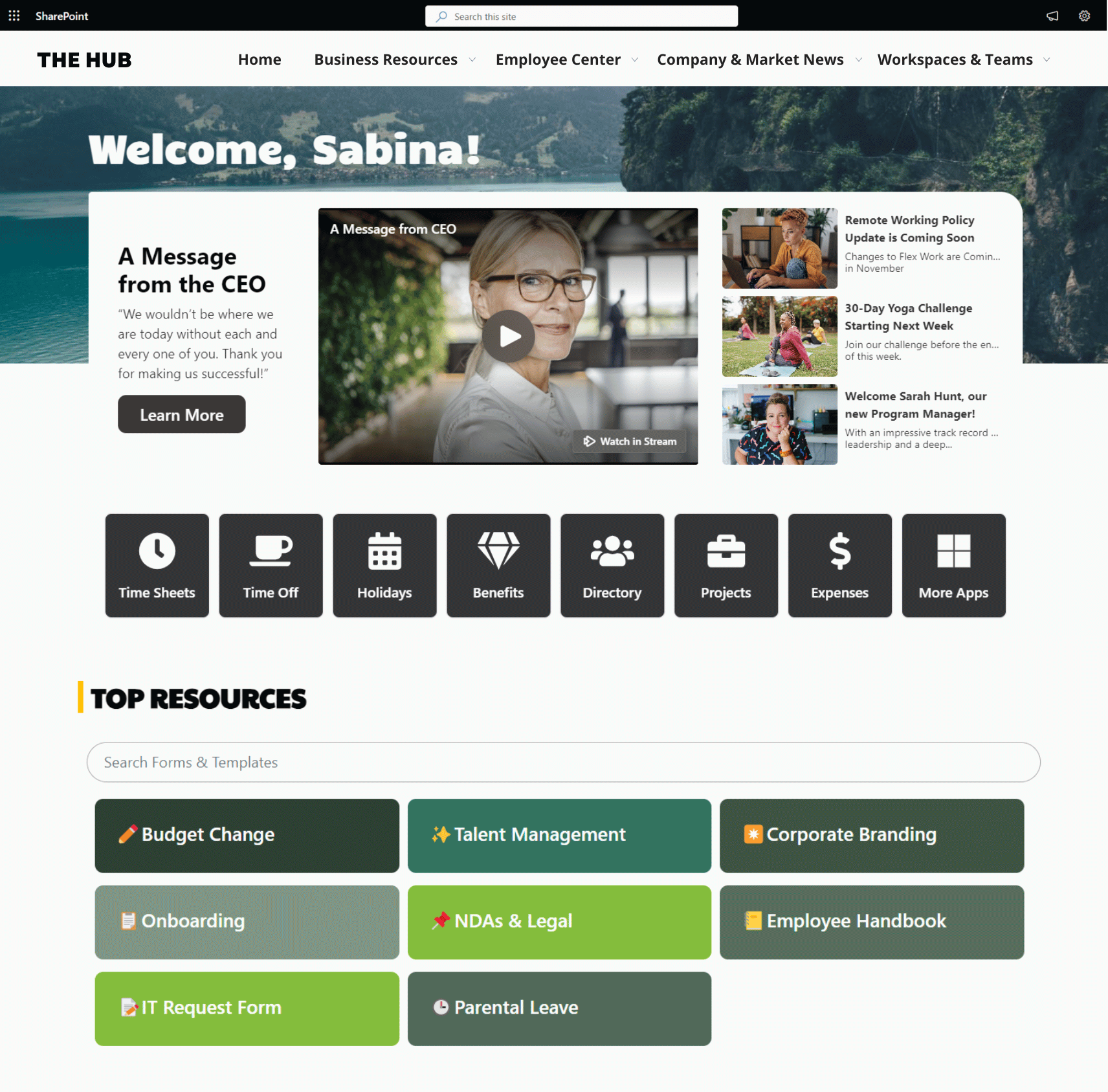
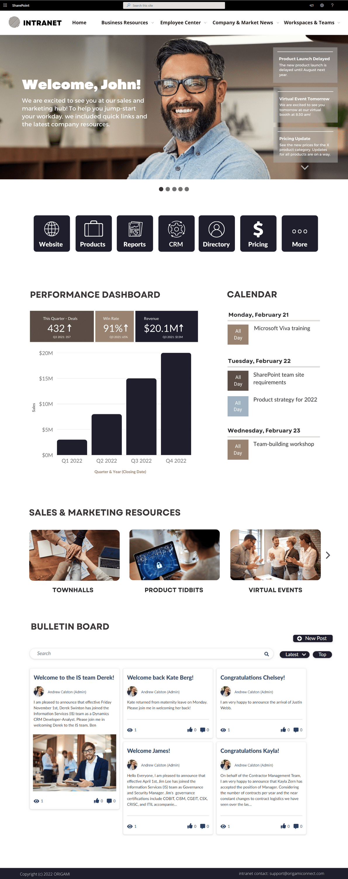
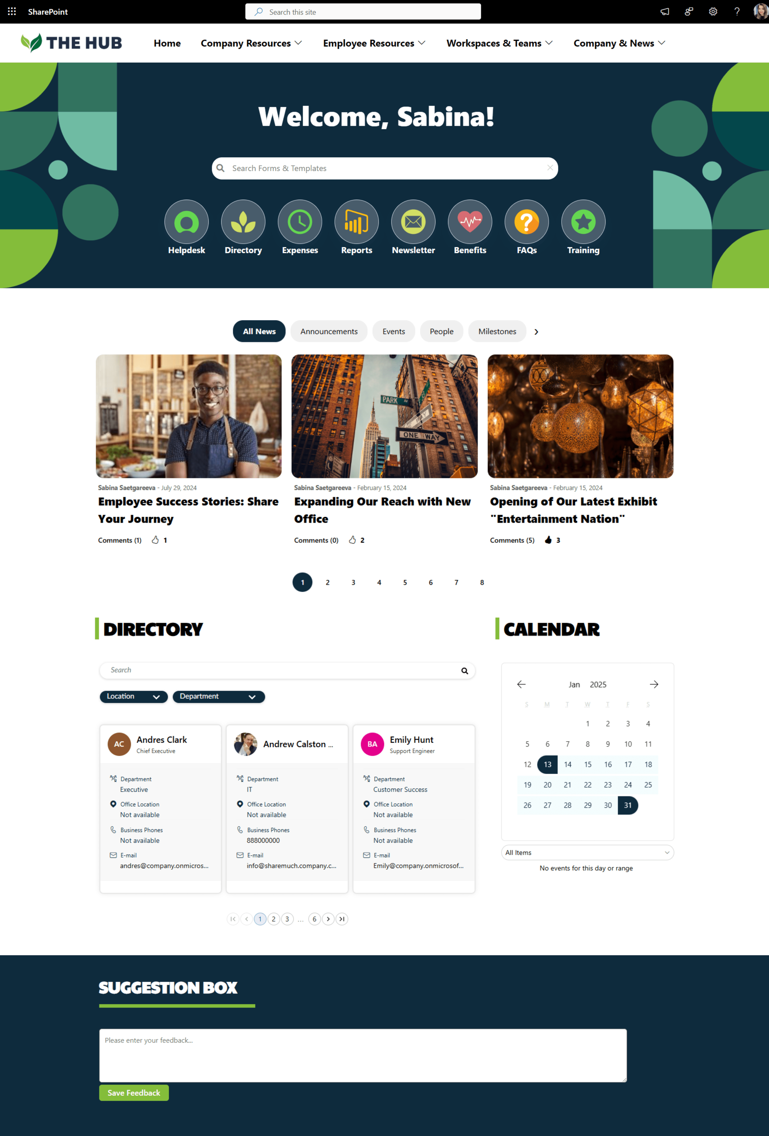
Enhance productivity and information access at your organization with this incredible list of 13 things you may not have even considered for your SharePoint intranet. Uncover the best content and information to move to your SharePoint intranet now in this amazing list.
Your SharePoint Intranet Adoption Success is 67% Dependent on these 5 Key Phases
Intranet Launch Check List and Activities
Can you measure the ROI of your intranet design efforts?
SharePoint Intranet Essentials and Must-haves for a Modern Intranet
7 Steps to Effectively Introduce an Employee Intranet & Digital Workplace
Your next document management system is going to be perfect!
First, let me give you a scenario:
You have 30 documents in a folder. You need to find a document with an “agreement” as part of its name. Would you use search or look through file names?
Hold that answer!
Here is a scenario 2. You have 30,000 documents and you need to find the one with the word “agreement” in it. Would you still look through file names manually?
Wait, how did I know you’re going to chose “manual answer” for the first scenario?
In one of my projects we tested user’s behavior in a similar sort of way as you did just now. Instead of files, they needed to find case records. We found that users resort to more structured approach when the amount of information they must deal with appears to be manageable. They prefer to look through views, names on a record, file creation date etc.
In contrast, when there is too much to go through, it becomes data. Data is best parsed by our unconscious intuition because our brain relies on finding patters since it understands that there is no match analyzing all the data consciously.
According to this an autonomous driving car processes 100GB of data each second – that's what your brain does and you don’t even bother!
Now, back to designing your document management system. How much data are you presenting to your users? Are you providing tools to help users find what’s in front of them?
Many organizations rely on search to help users find documents, but do nothing to improve it. Is your search contextual? Is content being searched for specific enough? What about draft content or duplicate sources? What about old and irrelevant content?
Here are few approaches to designing better document management systems:
1. Turn data into information as early as possible. It’s easy to create a document library and drop forms in Excel format into the library, but now the data in those Excel sheets is not readily available until someone opens the file.
Perhaps a better solution is to offer users enter the data in a structured way using a list, CRM system, or an app.
Now that data is safe but you can also report on it, draw pretty graphs, search with variety of filters and tools. I’m not suggesting you should convert every document into a list or an app. Simply identify those high traffic, high value types and automate them. The effort you’ll spend will pay off each time your users interact with the structured data.
2. Retire obsolete content. Why, you ask? Isn’t storage cheap? Yes, the storage is cheap but not the time your users are going to spend looking for something useful in a whole pile of not so useful, old content.
You don’t have to delete things right away. With SharePoint you can set expiration workflows which will automatically archive and eventually delete content passed their set expiration. You can even have SharePoint send you a report of expired content before you decide on what to do with it. So if those are business expense receipts you’re keeping for the 10th year – it’s time for them to go.
3. Know your user’s workflow and design the system accordingly. Does your user’s day start with working on documents from yesterday or last month? Perhaps create views to help them see most recently accessed or worked on documents. Perhaps you need a “manager view” to separate some features used mainly by managers and not overburden the interface with too many filters and buttons.
If part of the workflow is for your users to fill in a form and attach a document, help them out by putting related functions together. Minimize button clicks, new browser sessions, tabbing and switching. If it doesn’t seem intuitive for you, and you built it, it probably won’t feel intuitive to others.
4. Eliminate useless features. Just because something is cool it doesn’t mean it’s helpful. With constant overload of new features in the product it’s important to only introduce the ones that will help your users. Think what’s usable, intuitive, simple, and easy to find.
Best part of all, most of the tools are there out-of-the-box so there is very little configuration investment involved.
What are your thoughts?
We’re here to help
If you have questions on how to make your intranet more engaging while leveraging your existing Office 365 and SharePoint investment, we’re here to help you make that impact.
Yaroslav Pentsarskyy is the Director of Product at Origami. He's also 8 time Microsoft MVP, speaker at many local and worldwide tech events, and a published author of several SharePoint related books.


See SharePoint intranet examples that will cut your research time and help you brainstorm ideas for a new Office 365 intranet.